__________
 Netherlands-based Rembrandt is a tough guy to track down. He never returns phone calls, doesn't do email and refuses to carry a cell phone. We were lucky enough to catch up with him on a recent trip to Europe, where he took a few minutes out of his schedule to talk about light.
Keep reading for the Q&A.
__________
Rembrandt Q&A
STROBIST (in itals): First of all, thanks for taking the time for the interview. Photographers have been studying your light and composition for many years, and actually getting some Q&A with you is fantastic.
REMBRANDT (in bold): No need to brown nose -- I have seen the Flickr threads. Clearly, Dave Hill would have been your first choice.
Already talked to him, here. But you're doing some cool stuff, too. Besides, after Vermeer sees this post, maybe he'll return my calls.
Doubt it. But you can try.
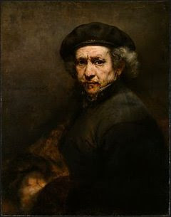
Let's start with your self portrait. One of many, in fact, this one having been done in 1659. Can you talk a little about it?
I always tried to keep a current self-portrait. You'd be surprised how many people do not have a decent head shot of themselves, for instance. Cobbler's kids have no shoes, as they say.
Speaking of numbers, you have done a ton of work. Some years, it is a new piece every month. What's up with that?
It's either that or hanging out on the message boards. I'd just rather be making pictures. Seriously, how much of your life can you spend complaining about the state of the industry? It's depressing.
I hear ya. Okay, so on the head shot -- one light source, up high and slightly camera right. Beauty dish?
No, straight, 7" reflector on an AlienBees AB800. If you look at the shadow under my nose, you can see it is harder than a beauty dish.
Oh, yeah. What about the fill?
Very little -- just a large, white foamcore at camera left. Almost not even there.
Nice and simple. How'd you get the warmth?
Quarter CTO. I like warmth on the key, but not too much. A lot of what you see in my work is color shifts due to time. The inkjet guy said archival. Bullshit. I started getting shifts after just 175 years. Boy, I miss Kodachrome.
Don't we all. What about the background?
You're gonna laugh. Wallpaper. I order it up special for each project right off of the web. Forty bucks. I cut three or four 2-foot-wide strips and match the pattern. Then I roll it right up into a tube to take to the location. We stick it on the wall with Fun-Tack, and Photoshop out any obvious seams. Keep it in a tube, use it over and over.
No kidding? I never would have known. Light, portable, cheap -- I love it.
You aren't the only one with ghetto DIY tips.
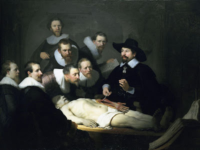
Fair enough. Let's move on to another one -- "Doctor Nicolaes Tulp's Demonstration of the Anatomy of the Arm." That's a mouthful. You couldn't pare that title down any?
Think metadata. It's done great stock sales for the last 378 years. But I have a sneaking suspicion my agency has shorted me, too.

Who is your agency?
I was originally with a great little European boutique agency -- mom and pop job. Great contract. But then they got bought and everything went straight to hell.
Who bought them?
Who buys everybody?
Oh, yeah. Right. So let's talk about the light. What can you tell us about it?
You tell me. What do you see?
Hmm... small-but-softish source. Beauty dish? Lotta watt-seconds to give you a good enough aperture to carry focus all the way through. Very high camera left, far enough away to reach across the frame pretty evenly.
Right so far, go on...
Fill... lessee... small strobe behind the guy second from right?
No, there would be secondary shadows. Those are hard to explain, visually. Try again.
Reflected fill off the collars? Really?
Yep. You get a lot of fill reflection when a white surface is in that close. Filled the patient's forehead nicely. Keep going.
Background lit by the main light?
Okay, now you're just not thinking. The key light is up high -- the top edge of the alcove would be lit, too.
Oh, yeah. Another light source, something soft down low. Softbox on the floor?
Yep. On an AB400 - just a smidge. Key was an AB1600 in a dish. Just two lights total, with a sheet on the ground infront out of the frame for minimal fill. Much more than that and you start to get unexplainable shadows too easily. Motivated light, motivated light.
What about that grody arm -- Photoshop?
Oh, no -- dead guy. It's done all of the time. You ever seen Joel Peter Witkin's stuff?
Please, I just had dinner.
Sorry. That dude is whack.
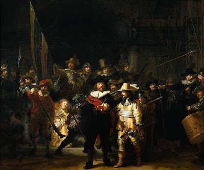
You're telling me. Can we talk about The Night Watch?
Sure. Everyone always goes for my production group stuff. Tell you one thing -- I get pissed every time I see one of those three-panel Annie Leibovitz Hollywood photos in Vanity Fair. Homage, my ass. And Neal Slavin? Don't even get me started.

You're an Old Master. People are going to go back to your themes over and over. They have a classic familiarity that stands the test of time. Why do you think we even go to art school? Because we want to learn to rip off the very best class of artist.
Yeah, well. Royalties would be nice. Maybe a little credit once in a while?
Alright, alright. So, who are your influences?
For this kind of stuff? I'm digging Drew Gardner lately. Have you seen his death of Admiral Nelson? Kickass.
Totally. He told me he wouldn't even drop the POV to lose the buildings in the background in the final shot. Retoucher's nightmare. Dude can stage a scene. He had a special "Nelson light" he sneaked in there, too.
That's what I'm sayin'. You have to tell a story with it, guide the eye with composition and light.
Okay, let's talk about that light. Your top light is eluding me. More than one?
Not so fast. Start with the fill, build from there. We hung a king-sized sheet behind camera and stuck two AB800's behind that for a huge, soft frontal light that would not call attention to itself.
Right. So how far did you drop the exposure on the fill?
Almost three stops. It was Night Watch, after all.
Okay then, how about the top light, which I still can't figure out. Where is it coming from? Way up high camera left?
Yep. But we cut it with a cookie -- think of a gobo with holes in it. Lets the light come through, but in a splotchy way. You get direction and hot spots.
So, you get a certain level overall. And since the holes in the cookie are "out of focus," if you will, you get a couple of brighter areas. Brings your eye exactly where I want it to go. Just one big AB1600 clamped into the rafters. That was our key.
So, the guy on the front right -- why can I see under his hat so well?
The fill light is stronger when you are closer to the camera. It's a great little cheat.
Of course! You decide how far the fill reaches in by how close you put it to the scene. All about the lighting distance, even for fill light. The closer you move it in, the faster it falls off as you work your way back into the scene.
Now you're thinking.
__________
Very cool. Thanks for hanging -- the beers are on us.
Yes, they are. Catch you later. And if you happen to see Annie, give her my best.
Không có nhận xét nào:
Đăng nhận xét