For better or worse, my goal is for this experience to serve as a sort of template for how I approach a new lighting technique.
This week deals with first attempts to reverse engineer how people were getting that cool, controllable 3-D tonality in their shadows, specifically by using ring flash.
When struck by the idea of on-axis fill, ring light is a no-brainer. It doesn't get any more "on-axis" than that, so it was my obvious starting point. What I would go on to find out was not only were there many options for creating on-axis fill, but also a seemingly endless number of combinations between the quality and quantity of the fill and the key light.
Whenever I am struck by a new technique, my programmed response is usually to shoehorn it into the very next opportunity I have to shoot. I'm impatient that way. But the point is to learn it ASAP, and hopefully in a way that does not screw up a paying gig.
Professional shooters as
That's the way I normally work, but this time I was too impatient. I felt like a kid in a candy store, and wanted to start playing with on-axis fill immediately, if not sooner.
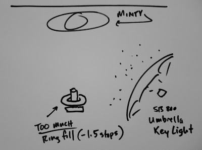
My first attempt at ring fill was against an umbrella key light, while shooting the lovely and enthusiastic Minty (that's her name) seen at the top of this post. It was at the Gulf Photo Plus event in Dubai. We were working very quickly, trying to get a selection of different looks from three different setups and outfit changes in the span of about 45 minutes.
To my credit I at least saved my on-the-job experimentation until the last of the three setups, which was outside of our conference room in the hall. The walls in the hall basically looked like seamless background paper, which was enough to qualify as a good setting in our academic conference environment.

The idea -- making this up as we went along -- was to position the key (umbrella, camera right) as I would if just shooting normally. Then I would dial in the ring fill and see what happened.
What ratio to use? Heck, I wasn't thinking that far ahead. In retrospect, it ended up being about one and a half stops -- too much fill, IMO.
Much like the first time I had shot someone with an umbrella against a sunset, I was happy enough with the first result that I did not press it by trying variations to see what would look better. That's a big mistake when trying new techniques, and one I will readily own up to. Because I do it over and over again.
In a turn on the old phrase "the perfect becomes the enemy of the good," it's more like "the good becomes the enemy of the way better."
Getting a cool result can keep you from pressing the idea further to see what else might happen. That's something you should always be on guard against.
When I edited my photos that night in my hotel room, I could see my problem much more clearly. The light directions were okay, but the ring fill had too much intensity. The result was that dimensionality had been stripped from the photo, and Minty had been reduced to almost a 2-D cutout.
It was like a layered paper sculpture, lit on different planes.
In general this is not a ring fill ratio I would use on people -- I'd want less of the fill. But, as with any screw up, you learn. And what I learned here was that on-axis fill is basically a control slider to enhance or compress the 3-D quality of your subject.
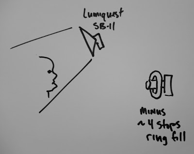
At left is Asif, a marketing exec in Dubai, whom I shot in the very next workshop. After Minty, you can be pretty sure I wasn't gonna over fill Asif. So naturally, rather than filling him a stop and a half down, I filled him at, like, four stops down.
Had I shot this for The Sun, our presses would have happily filled in all of those subtle, dark tones with nice, black ink. You cannot do this on newsprint and expect to get away with it.

The photo was obviously inspired by Peter Yang's eerie shot of Admiral Fox Fallon. I previously had worked through this poor-man's version of Yang's big, gridded reflector by substituting a small LumiQuest soft box instead. I used a Soft Box II at the time, but my preference now would be the new Soft Box III, as it is a little bigger. (Both will work, though.)
But what about the grid? Isn't that critical?
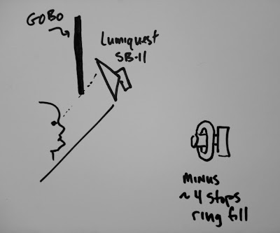
Well, no. Not really. It is what the grid does that is critical, which is to create a shaft of light that keeps the top of the person's head from being illuminated. You can also go that with a simple gobo.

As you can see from the diagram, the gobo allows the light to reach the subject's face, but not the top of the head. If you place the gobo closer to the subject, the line is harder. Place it closer to the light source and the line into darkness gets softer.
I like to place it pretty close to the (small) source, and at a height to where the subject's eyes can see about 3/4 of the light source. This tells me that the eyes will be positioned about 1/4 of the way into the transition from lit area to shadow area.
This is offset by the fact that the eyes are closer to the light source on a relative basis than are the lips, chin, etc. These two factors tend to cancel each other out in a cool way.
But this post is about ring fill, right? And besides, I am not put on this earth just to ape someone else's light. I want to shape it in new ways and do my own thing.
So I wanted to keep the dark look of the photo, yet still be able to see up into the shadows a little bit in a controlled way. That's where the ring fill does the job perfectly.
I am filling at almost four stops down, which is a tremendous chasm of a lighting ratio by most measures. Example: That's a white piece of paper a few feet behind Asif, going almost black. (That is straight from Lighting 102 - Position | Distance.)
Again, from a newspaper standpoint, it's a big 'ol fail. But, there may be times when I want this tiny peek into the shadows. On an RGB display, it is legible -- just at the edge, really -- but I can dial this in any way I want now, because I have seen the upper and lower limits.
But, the "screw ups" are defining my boundaries. And I could very well decide to go there again, too. It is my choice, depending on the look I want and the medium in which the photo is gonna run.
A stopped watch is right twice a day, and even a blind squirrel finds a nut once in a while. So given that I had missed on both high and low on my ratio, I hopefully would be ready the next time.
You can see a full write-up on the contortionist photo, which was a direct offshoot of the test shots above, in this post from earlier this year.
If there is anything that should be stressed, it is (a) that zeroing in on the look you want is a logical process, and (b) you should not expect to happen upon an ideal look right out of the starting gate. It takes testing and experimentation -- and learning from the "close-but-no-cigar" photos is a valuable part of the process.
NEXT: Ring Fill Against Hard Key
_______
UPDATE: For those who asked, the ring flash I was using is a Ray Flash ring flash adapter.
Không có nhận xét nào:
Đăng nhận xét