Thứ Sáu, 31 tháng 10, 2008
November 1st Means Fire Sales on Fog Machines
It's that time of year again -- Halloween is almost in the books and anyone who sells those cheapo novelty fog machines will be pretty much giving them away tomorrow morning.
They only start out at about $30, were in the low $20's by today and soon will be about ten bucks. The fog juice will be cheap, too.
They don't work too great (they tend to gum up eventually) but at $10, if they smoke up good for even one shoot it is pretty hard to lose on that deal.
How to Make This Photo
Pictured above is one of about 20 decorations at the home of our next-door neighbors, Mark and Prissy. (Our block really gets into Halloween. The kids come from far and wide to check out the creepiness and gorge themselves on candy.)
The only added light for this was one small flash—a Nikon SB-800—placed at her feet. The ambient light, a sodium vapor street light, was coming from behind. The haze from the cheap Halloween fogger helped to spread and refract the light in the area around the ghoul. (Which is what makes them awesome for standard portraiture, too. Here are two examples.)
I exposed for the fogged backlight (about 1/4 second) and the flash on the ground lit our calendar ghoul from the front. The streaks were caused by zooming during the exposure. You'll get better results if you (a) zoom from wide to tele, and (b) start zooming just before you press the shutter.
-30-
Thứ Năm, 30 tháng 10, 2008
On Assignment: Reluctant Poet
Linda Joy is a free spirit and a very creative person. So I knew I would be able to play a little with the lighting. But, like many people, she loathes having her photo taken. And that always adds another wrinkle to the shoot.
Keep reading to see how we approached the issues, both lighting and psychological.
"I Hate Having My Picture Taken."
That was the first bit of instruction I got from Linda Joy. And if I had a dollar for every time I had heard that from a subject, I could probably retire. In fact, if someone came up to me and said, "I really love having my picture taken," my first thought might be that they were a tad off-center, if you know what I mean.
So, from square one I know that the lighting, setting and compositional considerations will all take a back seat to Linda Joy's primary concern. And my most important job is to make sure she can relax and to let her know that my primary goal is to make a nice photo of her.
Someone who does not like to be photographed tends to see the camera as a bit of an enemy, and that can easily transfer to the photographer. It's something you should be aware of, and you can work proactively to let the subject know that you are on the same side.
My approach is, as much as possible, to have gear pre-set when they arrive so you can just walk and talk them through the settings before they really have a chance to worry too much. At the same time, I want to pay close attention to whatever happens to be working well during the shoot and to make a point to reinforce those aspects in conversation.
Get There Early
Having chosen a location, my first job is to scout it for good angles. Our light is pretty diffuse here (open shade on a sunny day) so in this case it is about background and environment.
There are lots of choices here, and I tend to make notes with the camera as seen at left. I like looking at the location in "picture notes" as they look much closer to how they will look in the final product.
I also will play with my ambient exposures at this point to see what the environment will look like if I walk the ambient down a bit.
We have talked before in the On Assignment section about the fact that shade is your friend. And as you can see here, it is -- for more than one reason.
First, obviously, the exposure is easier to tame so we can bring the subject back up with flash. Figure three stops -- a big difference -- from the nearby full sun. It is dim enough so that you do not necessarily have to shoot at a 250th, too. Which gives you a little more control over the levers.
I keep a personal catalog of nearby settings and backdrops in my location notes folder, and each backdrop has a cardinal direction attached to it, too.
I live in the northern hemisphere, so the north side of a building will always be in shade. These are my prime backdrops -- they are good 24/7, in terms of controlling the sun.
In this case, my backdrop was on the west side of the building. So that meant a morning shoot. FWIW, this is why west-wall locations are lowest in my personal pecking order. Not a morning guy.
Second, I like the shade because it is cool. Literally, in the summer, but here I mean color temperature. And that coolness is enhanced even more when you drop the exposure a stop or two.
Working Together
When Linda Joy arrives, I am ready to shoot quickly if need be, or to keep going if things work well. For the first setup, I used an older White Lightning Ultra 600 in a Photoflex soft box. The WL's flash tube is UV balanced, and old. This makes it warm enough to forego the usual Rosco 1/4 CTO or Rosco "08" warming filter I normally use on my key light.
I brought the WL because I did not know how big of an area I would want to light. In this open shade, I could have done the same thing with an SB-800 (or two, at max) in a shoot-through umbrella.
If you look up the stairs, you'll see a second flash (an SB-800) backlighting them. In my setup I went with this light, but in the end I chose to leave the stairs dark. They were very near the edge of the frame and provided an easy exit point for the view. (Hello -- lit stairs, heading out of my frame. Talk about an engraved invitation to leave the photo...)
I kept Linda Joy talking, finding out as much as possible about who she was and what she did, creatively, as we shot. This kept her thinking about things other than the photographer with the digital Uzi pointed at her.
I also used one of my favorite tricks -- coming out from behind the camera. Even though I normally do not shoot with a tripod unless I am bringing up a really dark ambient, I can usually frame a photo and then move my face out from behind the camera as I shoot. Your aim will shift a little bit, but if you zoom out a tad you can fix this easily in post.
The eye contact usually relaxes people a bit, and helps to create a stronger interpersonal exchange. Sounds silly, but it helps.
The open sunlight to the camera right side of the frame made a nice light source and I could grab a series of head shots in just a couple minutes.
Don't ignore what the ambient is offering you just because you trucked in the flashes. Being able to light is an additive skill, not a death sentence to available light shooting.
Next, over to the tree, where I wanted to do another setup.
Remembering the exposure test seen above, I dropped my ambient about two stops and then set up an SB-800 in a Lumiquest SB-III as a key light.
My key (the LumiQuest SB-III) is a pretty hard light source at that distance. But that's okay because I am going to fill with ring to be able to see into the shadows while still keeping that background ambient muted and blue.
Against the blue, I gelled my SB-800 key light with a 1/4 CTO. One of my SB-800's has a 1/4 CTO pretty much permanently attached. I just use it as my key all the time, which saves me any gel swapping.
What can I say? I am lazy.
So, the ambient sets the exposure -- dropped for color and tonal contrast. To that I add in my key, until the tree looks right. (Linda Joy approximates the tree on a tonal basis, so that will be an easy adjustment if needed when she steps in.)
To that, I add some ring fill (hey, I been practicin'...) which will bring up her shadow side exactly as much as I want. Controlling the drop-off amount to shadow allows me to use a smaller key light source and get away with it. If the shadow does not drop off too far, it can be harder with no ill effects.
Sure, she knows she is getting her photo taken. But by now the edge has worn off a little. Also, I have showed her some of the results of the shoot up until now, and the thought has occurred to her that I just might not be out to make her look terrible. Imagine that.
About five minutes later we were done. And we still had our entire day ahead of us, as we would normally both have been just rolling out of bed about now.
__________
NEXT: On Assignment: WiMAX
UK Readers, Save the Date: London Lighting Seminars Coming December 6th and 7th
Just a quick note to the UK folks: I am in London in early December, so I have booked a classroom at ULU for two full-day lighting seminars. We'll be doing the regular format (see here for example). The current exchange rate means the price will be £129,00.
Registration opens Monday, Nov 3rd, at 8:00 p.m. (2000 hours) London time. Full info and links to register via PayPal will be posted at that time.
-30-
Registration opens Monday, Nov 3rd, at 8:00 p.m. (2000 hours) London time. Full info and links to register via PayPal will be posted at that time.
-30-
OT, But Critical and Time Sensitive: Digital Railroad Implosion Info
Please pardon the OT post. It's a bit of an emergency for many shooters. Thanks.
__________
If your stuff is on Digital Railroad, which is shutting down in such an abrupt way as to hose its photographers, you have until midnight on Oct 31st (PST/GMT-8) to migrate your stuff to someplace safe. Even this short time frame was won of hard negotiation.
This is way off topic for this site, and I have thus far resisted the urge to go off-niche to cover this story. But I am sure that many readers are affected, and DRR simply is not giving its shooters time to migrate in an orderly way.
If youare were a client, act fast -- as in now.
For more info and in-depth coverage:
• Photo Business Forum, shows exactly how to migrate via FTP (Thanks much for that info, John)
• Vincent Laforet, expressing the anger felt by many shooters
• PhotoShelter, just off of a closure of their own, tries to pick up the DRR pieces with help (they negotiated the extension) info, offer
• PDN Online story , with ongoing coverage at PDNPulse
-30-
__________
If your stuff is on Digital Railroad, which is shutting down in such an abrupt way as to hose its photographers, you have until midnight on Oct 31st (PST/GMT-8) to migrate your stuff to someplace safe. Even this short time frame was won of hard negotiation.
This is way off topic for this site, and I have thus far resisted the urge to go off-niche to cover this story. But I am sure that many readers are affected, and DRR simply is not giving its shooters time to migrate in an orderly way.
If you
For more info and in-depth coverage:
• Photo Business Forum, shows exactly how to migrate via FTP (Thanks much for that info, John)
• Vincent Laforet, expressing the anger felt by many shooters
• PhotoShelter, just off of a closure of their own, tries to pick up the DRR pieces with help (they negotiated the extension) info, offer
• PDN Online story , with ongoing coverage at PDNPulse
-30-
Thứ Tư, 29 tháng 10, 2008
Nick Turpin Ditches his SB-800s for a Cell Phone
(RSS and email subscribers may have to click on the post title to see the video.)
Remember Nick Turpin, who did those beautiful SB-800-lit street portraits of thriller writers for Arena Magazine?
Now, he has ditched even those and is shooting his current month-long campaign for Samsung using only a cell phone. No DSLRs, no flashes, no female assistants holding long poles. And he is not even in control of what he is shooting -- you are.
Your clicks on each new photo in the the evolving site decide where he is going next. It is live now, at The Photographic Adventures of Nick Turpin. You can follow his cell-phone video diary from his trek via his YouTube Channel, too.
(Via What's the Jackanory)
-30-
Thứ Ba, 28 tháng 10, 2008
FYI: DIY PVC CSB
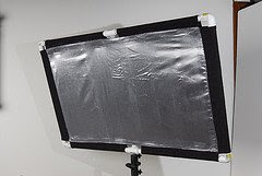 I finally got a chance to meet Peter Geller, of California Sunbounce, at PDN's Photo East shindig up in NYC last week. He had all of CSB's toys strewn out in a way that is very unfair to those of us looking to escape the show with our wallets intact.
Their system is totally comprehensive and can create just about any light-modifying setup you could possible imagine -- if you have the moolah. But if you are a dirt-broke college puke (or perhaps a former Lehman brothers executive) you may have more time than money at this particular point in your life.
If that is your situation, you might want to take a look at this DIY version of the CSB Micro Mini, which is proving to be popular enough to be in a backorder situation on the accompanying flash mounts.
(And check out "we-knew-him-when-he-wasn't-famous" Bert Stephani starring on the Micro Mini webpage, too...)
Back to the DIY. Thanks to reader John Gibney, if you have a little patience and know your way around a sewing machine you can try out a DIY version to see if all this bouncing stuff is right for you. He gives pretty detailed instructions on his blog -- even how to include a 5/8" stud for mounting a flash or sticking the bounce in an umbrella swivel.
(Thanks much, John!)
-30-
Chủ Nhật, 26 tháng 10, 2008
On-Axis Fill: Ring Fill Against Restricted Light
Hard key light leaves hard shadows. And if you are not taking into account the ambient light (maybe the ambient light quality sucks, for instance) on-axis fill can reach into shadows and open them up in a highly controllable way.
Keep reading for two quick set-ups, and a refresher on ratio control without a flashmeter.
Swamp Thing
This summer as I was looking for any excuse to experiment with ring-as-fill, my son Ben returned from a day at camp wearing the shoes you see pictured at the top of this post.
My wife: "Do NOT come inside with those shoes. Clean them off with the hose outside."
Me: "Don't clean 'em yet! I want to shoot them. (... on your mother's great-grandma's antique cutting board, I did not say out loud...)"
Hey, we don't use the board for cooking. It is mostly used as decor against the counter backsplash. And it covers up the mess and tangled wires around the phone pretty well, too.
We only have a few minutes before dinner, so this will have to be quick. No problem, as I already have my background (secretly) picked out. I love shooting details like this for the family album, and these shoes say a lot about a well-spent summer day for a seven year-old boy.
Having seen what the ring would do against an umbrella, I wanted to play with some hard light. My thinking was, this combo will let me dial in however much texture I wanted by filling against a hard shaft of light.
But before I could make the hard key, I needed my ring flash as fill. I cranked my lens down to a very small aperture to hold focus and dropped the shutter speed to 1/250th to kill the ambient. Then, I adjusted the power output on the (manual) ring flash until I got the proper exposure.
(I was using a Ray Flash adapter fitted onto a Nikon SB-800 speedlight for the ring light.)
Now, since I was already way down on the aperture, I dropped the ISO a couple of stops to take the ring flash from being properly exposed down to a nice fill. I looked at the histogram and rear display and it looked like a nice "baseline exposure" for what would become my shadows in a moment.
This is no different than dialing down your ambient before you add in your key light, except that it was all being done with flash.
Now, for the hard fill.
Using a set of ten-dollar barn doors designed for small flashes, I closed off the spill of the key light until just a small beam was getting through from hard camera left. I used a 1/2-strength CTO gel to warm up the key somewhat to accentuate the color of the mud.
Given that my shooting aperture is set, as is the number of stops I have already dialed down my fill, the only thing left to do is to adjust the key light until the direction and exposure looks best.
No meters -- just eyeballing the relationship between the tones on the rear screen and making sure my histogram is not out of whack.
Quick and easy, and I notch another quick experience in my goal to get more comfy with on-axis fill. Honestly, the hardest thing about the shoot was smuggling the cutting board out of the kitchen (and back in) without Susan noticing.
I really like the ring-against-raking-light look on the muddy shoes. The highlights are crisp, but you can see right into the shadows -- exactly as much as I want, thanks to the lighting ratio on the fill. The ring also gives that characteristic wraparound shadow -- which looks kinda cool against the highlights, too.
Ring Against Grid
This portrait of Em, done in the last days of single digits before her tenth birthday, was the first time I had worked with ring and grid light. But I already had a good idea what to expect, thanks to experimenting earlier with on-axis fill and umbrella key in Dubai.
There are two ratios to consider here, and if you are into reverse engineering should be able to spot them by looking closely at the photo.
The first is the ratio of the ring (which will end up being the fill) over the ambient. You can see how far the ambient drops off by looking at the depth of the ring flash shadow (around Em) compared to the surrounding bricks in the areas of the photo not lit by the gridded key light.
The second ratio is that of the gridded key light over the ring fill light. This you can see in the shadows on Em's neck and under her nose. (These shadows are left by the key light, but are lit by the ring fill.)
Which means that in this setting, we have two control levers to adjust the contrast range of the photo. The ring flash was about a stop and a half over the ambient and the gridded key (coming from upper camera right) was another stop and a half over the ring light.
(If this shorthand exposure information doesn't make sense, take a look at this post.)
I have to say, I immediately loved the look of the ring fill against the gridded key. It was crisp and open all at the same time, and every portion of the photo was tonally legible in a controllable way.
Baseline Exposure Cheat Sheet
I was starting to get familiar with the Ray Flash, and was finding that it knocked off a little more than the one stop (vs. direct flash) advertised by the manufacturer. To be fair, after testing I found it to knock off about 1.2 stops -- if you used the 24mm throw as a bare-flash comparison.
Real-world (50mm throw) I would call it close to two stops. But that is still plenty powerful to use as a beautiful fill light at portrait distances outside.
Having experimented in a darkened room, I tested it to see how much light it would throw in a given ISO and power setting. To help me learn get faster at future setups, I stuck my standard cheat sheet on the Ray Flash:
The numbers:
1/2 power -- ISO 400 -- 10 Feet -- f/8
From there, I could quickly interpolate differences in any future setups to get a starting point for my power setting in manual.
Comfortable with the tests, I was ready to try ring light as fill on an assignment -- confident that I probably would not screw it up completely.
Thứ Năm, 23 tháng 10, 2008
Great Video on Overclocking Your Sync Speed
We talked about this in the sunset tiki hut portrait a ways back, but wedding shooter David Ziser has put together a well-done twelve-minute tutorial on working above your flash's native sync speed for outdoor lit portraiture.
(This, of course, does not get you anywhere near the insane sync speeds with the SB-800 diagnostic mode detailed early last April, but it is way easier to pull of, with no complicated button sequences...)
See the original post at Digital Pro Talk. Thanks to David for the vid and to everyone that let me know about it.
-30-
Thứ Ba, 21 tháng 10, 2008
Nikon SB-900: Joe Bob Goes to the Movies
Those of you of a certain age will remember Joe Bob Briggs, who used to review guys' movies for the newspapers the way a guy would want a movie reviewed.
Steel Magnolias? Zero stars. Way too much emotional junk.
Texas Chain Saw Massacre? Instant classic -- it has chain saws, fer cryin' out loud. Get the Oscar buzz started!
I was very disappointed to find out that the "Joe Bob" in the new Nikon speedlight video were in fact Bob Krist, internationally known travel photographer, and Joe McNally, some guy I have never heard of.
Sadly, the video is not available yet, nor are the online excerpts -- they are coming next week, from what I hear. So why am I even telling you this?
Because the release of the SB-900 video trips in a little gentleman's agreement about the previous, SB-800 "Speed of Light" video...
__________
A few years ago, this Joe McNally guy filmed a video for Nikon on the (then) new SB-800s, showing just what they could do by using CLS in a real-world environment. It was a capabilities/brochure type of thing, and they probably underestimated the demand for nuts-and-bolts, exact "how-to" type of stuff.
The video was called, The Speed of Light (spoiler alert: 186,000 miles per second) and was a great tease to get you pining for six SB-800s.
The feedback, of course, was that now everyone wanted to know exactly how to do this stuff: What do I set the +-TTL at? Why use the dome outside? How do I find a contortionist and a glass box in the middle of the desert?
So, from what I understand at least, they are looking to be more nuts-and-bolts in the current iteration which is now in the can and ready for release. The new video is five times as long as the last, which should allow for more detail in the process.
From what I hear, they had fun filming it, too. Rumor was that Bob and Joe actually pretended to get pissed off at each other, almost to the point of coming to blows (my money is on Bob -- he's a scrapper) just to worry the director while shooting. That's why you never let the photographers outnumber the directors.
But enough of that. Back to the Speed of Light video.
__________
Here it is, embedded. If you are viewing this post via RSS or an email subscription, you probably won;t be able to see the video. You can get to the full web version, with video, here.
The vid has been up on Google Video for several months, and is a total bootleg upload. I was tipped to it by several readers way back when.
Normally this is a strict no-no, and results in DCMA takedown notices out the wazoo almost immediately. But I talked to several people at Nikon and the idea was batted around that letting this one go into the wild at this point might not be such a bad thing. Simple cost-benefit analysis. But I agreed that it would best to wait until the next-gen SB-900 video was announced before linking to the old SB-800 video.
There is a lot of information in it, but the flash itself is discontinued. (Bastards! They killed Kenny!) Which means the commercial value for an SB-800 video is down to the flat part of the long tail chart. So, given that they (a) know it is out there and, (b) have not yet DCMA'd it, you are not starving anyone's babies by watching it.
It's about half an hour long. IMO, the best part of the video has nothing to do with lighting. CLS shooters will learn from it, of course. But the real takeaway is watching this Joe guy work.
When you are watching this, pay special attention to how Joe paces his shoot. Note how he keeps his subjects engaged, how he uses their time and attention efficiently. A good shoot is all about a steady stream of communication and keeping a good rhythm going with the subjects.
He's too modest a guy to tell you this, so I will: His long-practiced ability to interact with his subjects is just as key to the success of his photos as is his lighting skill. More so, actually. It's a dance, and someone has to lead.
You can get great photos all day long with good subject interaction and finessing whatever available light you can find. Not so the reverse. If you do not gel with your subject, all the fancy flash in the world will not make a great portrait.
I am very much looking forward to the new vid (hopefully, with a director's cut including the fight scenes) when it pops up. I'll point to the excerpts online whenever they are posted.
Hey, Nikon -- why not YouTube that trailer and let it fizz a little?
And I would be curious to hear your thoughts on the interaction and rhythm thing in the comments below. What did you come away with?
__________
New Speedlight Video: Nikon Press Release
Heading to the Big Apple
I'll be out of touch up in NYC without a laptop this week at Photo Plus Expo for a full schedule of meetings, booth browsing and cocktail imbibing. Please say hi if you happen to see a dumpy, middle-aged photographer walking around the convention floor sporting a "Strobist" credential. (Yes, we're sending the entire editorial staff...)
I'll be at hanging out the MPEX booth (they got DVD specials and "dozens" of vintage Nikon SB's) on Friday from 11:00 a.m. to lunch time. Also, Joe McNally will be demo'ing speedlights at the Nikon booth Thursday from 2:30 - 3:00 p.m.
Hope to see you there. Please feel free to leave any party time/location/secret handshake info as a "do not publish" comment below. If I can swing it, I'll try to stop by.
-30-
Chủ Nhật, 19 tháng 10, 2008
On-Axis Fill: Experimenting with Ring as Fill
For better or worse, my goal is for this experience to serve as a sort of template for how I approach a new lighting technique.
This week deals with first attempts to reverse engineer how people were getting that cool, controllable 3-D tonality in their shadows, specifically by using ring flash.
When struck by the idea of on-axis fill, ring light is a no-brainer. It doesn't get any more "on-axis" than that, so it was my obvious starting point. What I would go on to find out was not only were there many options for creating on-axis fill, but also a seemingly endless number of combinations between the quality and quantity of the fill and the key light.
Whenever I am struck by a new technique, my programmed response is usually to shoehorn it into the very next opportunity I have to shoot. I'm impatient that way. But the point is to learn it ASAP, and hopefully in a way that does not screw up a paying gig.
Professional shooters as
That's the way I normally work, but this time I was too impatient. I felt like a kid in a candy store, and wanted to start playing with on-axis fill immediately, if not sooner.
My first attempt at ring fill was against an umbrella key light, while shooting the lovely and enthusiastic Minty (that's her name) seen at the top of this post. It was at the Gulf Photo Plus event in Dubai. We were working very quickly, trying to get a selection of different looks from three different setups and outfit changes in the span of about 45 minutes.
To my credit I at least saved my on-the-job experimentation until the last of the three setups, which was outside of our conference room in the hall. The walls in the hall basically looked like seamless background paper, which was enough to qualify as a good setting in our academic conference environment.
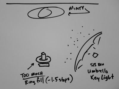
The idea -- making this up as we went along -- was to position the key (umbrella, camera right) as I would if just shooting normally. Then I would dial in the ring fill and see what happened.
What ratio to use? Heck, I wasn't thinking that far ahead. In retrospect, it ended up being about one and a half stops -- too much fill, IMO.
Much like the first time I had shot someone with an umbrella against a sunset, I was happy enough with the first result that I did not press it by trying variations to see what would look better. That's a big mistake when trying new techniques, and one I will readily own up to. Because I do it over and over again.
In a turn on the old phrase "the perfect becomes the enemy of the good," it's more like "the good becomes the enemy of the way better."
Getting a cool result can keep you from pressing the idea further to see what else might happen. That's something you should always be on guard against.
When I edited my photos that night in my hotel room, I could see my problem much more clearly. The light directions were okay, but the ring fill had too much intensity. The result was that dimensionality had been stripped from the photo, and Minty had been reduced to almost a 2-D cutout.
It was like a layered paper sculpture, lit on different planes.
In general this is not a ring fill ratio I would use on people -- I'd want less of the fill. But, as with any screw up, you learn. And what I learned here was that on-axis fill is basically a control slider to enhance or compress the 3-D quality of your subject.
At left is Asif, a marketing exec in Dubai, whom I shot in the very next workshop. After Minty, you can be pretty sure I wasn't gonna over fill Asif. So naturally, rather than filling him a stop and a half down, I filled him at, like, four stops down.
Had I shot this for The Sun, our presses would have happily filled in all of those subtle, dark tones with nice, black ink. You cannot do this on newsprint and expect to get away with it.
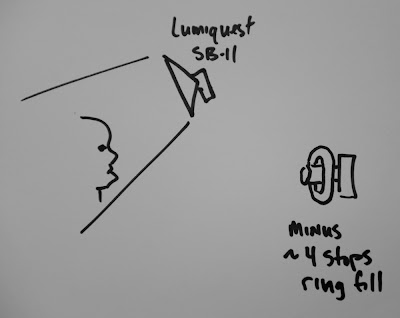
The photo was obviously inspired by Peter Yang's eerie shot of Admiral Fox Fallon. I previously had worked through this poor-man's version of Yang's big, gridded reflector by substituting a small LumiQuest soft box instead. I used a Soft Box II at the time, but my preference now would be the new Soft Box III, as it is a little bigger. (Both will work, though.)
But what about the grid? Isn't that critical?
Well, no. Not really. It is what the grid does that is critical, which is to create a shaft of light that keeps the top of the person's head from being illuminated. You can also go that with a simple gobo.
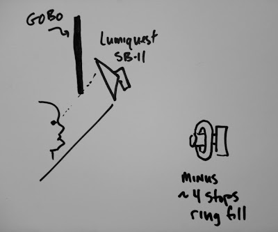
As you can see from the diagram, the gobo allows the light to reach the subject's face, but not the top of the head. If you place the gobo closer to the subject, the line is harder. Place it closer to the light source and the line into darkness gets softer.
I like to place it pretty close to the (small) source, and at a height to where the subject's eyes can see about 3/4 of the light source. This tells me that the eyes will be positioned about 1/4 of the way into the transition from lit area to shadow area.
This is offset by the fact that the eyes are closer to the light source on a relative basis than are the lips, chin, etc. These two factors tend to cancel each other out in a cool way.
But this post is about ring fill, right? And besides, I am not put on this earth just to ape someone else's light. I want to shape it in new ways and do my own thing.
So I wanted to keep the dark look of the photo, yet still be able to see up into the shadows a little bit in a controlled way. That's where the ring fill does the job perfectly.
I am filling at almost four stops down, which is a tremendous chasm of a lighting ratio by most measures. Example: That's a white piece of paper a few feet behind Asif, going almost black. (That is straight from Lighting 102 - Position | Distance.)
Again, from a newspaper standpoint, it's a big 'ol fail. But, there may be times when I want this tiny peek into the shadows. On an RGB display, it is legible -- just at the edge, really -- but I can dial this in any way I want now, because I have seen the upper and lower limits.
But, the "screw ups" are defining my boundaries. And I could very well decide to go there again, too. It is my choice, depending on the look I want and the medium in which the photo is gonna run.
A stopped watch is right twice a day, and even a blind squirrel finds a nut once in a while. So given that I had missed on both high and low on my ratio, I hopefully would be ready the next time.
You can see a full write-up on the contortionist photo, which was a direct offshoot of the test shots above, in this post from earlier this year.
If there is anything that should be stressed, it is (a) that zeroing in on the look you want is a logical process, and (b) you should not expect to happen upon an ideal look right out of the starting gate. It takes testing and experimentation -- and learning from the "close-but-no-cigar" photos is a valuable part of the process.
NEXT: Ring Fill Against Hard Key
_______
UPDATE: For those who asked, the ring flash I was using is a Ray Flash ring flash adapter.
Thứ Năm, 16 tháng 10, 2008
And the September Pocketwizards go to...
Congrats to German photographer Puthan Valiyandi, who used a set of eBay remotes to win himself a set of Pocketwizard Plus II's in September's video contest.
The coolest part of the video? Gotta be the "flashlight" mod. I want one.
We still have two more sets to give away -- details here.
-30-
Gels: New Developments
I am busy working on the next post for the on-axis light series for Monday. But I wanted to take a moment to bring you up to speed on some new gel-related stuff.
After the jump, two new small-flash-related gel items, and an "I Know a Guy" gel source so cool I almost wished I lived in LA.
Almost.
Hold Everything: The LumiQuest FXtra Gel Holder
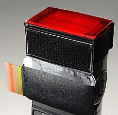 LumiQuest's Quest Couch would like to personally thank you guys for the free product development consulting, as he reports that the FXtra gel holder was developed "100 percent" due to input from this group.
He tweaked the design to fit most any speedlight other than the Vivitar 285 (which is not only very big but also has its own built-in gel slot) and added a few features that will probably make many of you happy.
First, it mounts to any flash using the (included) hook-and-loop fasteners, and passes the fastener through to the outside. That means that you can mount an FXtra to a flash and then mount another light mod on the outside of the FXtra.
Second, he included a pocket to store gels with the flash when you are not using them. It is almost as if he took a long hard look at the photo stuff strewn all over the floorboards of my car when we met for lunch a few months ago.
Last but not least, included with the FXtra is a selection of commonly used gels (and a few effect colors) cut to size:
• CTO (tungsten conversion)
• 1/2 CTO
• 1/4 CTO
• Plus Green (fluorescent conversion)
• Sky Blue
• Canary Yellow
• Fire Red
The gels are sized to extend past the holder to fit the larger flash heads (SB-26s, Canon 580s etc.) but can be trimmed to fit the SB-800s, -600s and other smaller flash heads.
FXtras are $19.95, and available at MPEX now and soon, everywhere. More info on the FXtra at LumiQuest.com.
Simple Solution to a Sample Problem
A thousand people taking advantage of a sample program is a good thing. A quarter million people taking advantage of it is too much of a good thing.
It is exactly for that reason that the Rosco gel sample packs were in danger of going bye-bye just a short while ago. But rather than shut it down, they decided to address the issue directly and in an economically sustainable way.
The result is the Strobist Gel Pack, which is currently under development. They are speedlight sized, no holes and multiple copies of the gels we use most. There is a selection of standard color balancing gels, with some effect colors thrown in -- and none of the stuff we end usually up throwing away.
I have seen a prototype kit, and I'm stoked. I can't tell you how happy I am that Rosco has chosen to respond to the needs of small-flash shooters -- and solved the gel sample problem with smart thinking rather than an axe.
Mad props to Rosco for this solution. More info as it becomes available and I definitely will be first in line to buy some Strobist gel packs.
They Were Expendable
 Several people came up to me at the recent LA lighting seminars and told me about "The Expendables Recycler," a very cool SoCal shop that buys leftover rolls of gels from movie sets and sells them at discount rates.
Typical savings are ~1/3 off of full retail, a price which is firmly supported by your local Theatre Supply monopoly. (They typically justify the full price by spelling it, "theatre" instead of "theater.")
BEFORE YOU COME CRASHING DOWN ON THIS PLACE, owner Todd Parker would like me to pass along a note that if you are just buying single 20x24" sheets to be shipped you are better off going to your local gelmafia supplier. But if you are getting gels in quantity (many sheets, full rolls, etc.) you'll definitely want to comparison shop.
He has lots of full rolls and partial rolls at decent discounts. And yes, I got myself a roll of Rosco #3008 Tough Frost diffusion material on the cheap before I told you about it. Heh.
UPDATE: Shipping costs are steep. If you are ordering via phone or mail, you'd better be prepared to bulk up if you want to save real money. But if you are local to SoCal, it's a no-brainer if you can pick up.
More info at The Expendables Recycler.
After the jump, two new small-flash-related gel items, and an "I Know a Guy" gel source so cool I almost wished I lived in LA.
Almost.
Hold Everything: The LumiQuest FXtra Gel Holder
 LumiQuest's Quest Couch would like to personally thank you guys for the free product development consulting, as he reports that the FXtra gel holder was developed "100 percent" due to input from this group.
He tweaked the design to fit most any speedlight other than the Vivitar 285 (which is not only very big but also has its own built-in gel slot) and added a few features that will probably make many of you happy.
First, it mounts to any flash using the (included) hook-and-loop fasteners, and passes the fastener through to the outside. That means that you can mount an FXtra to a flash and then mount another light mod on the outside of the FXtra.
Second, he included a pocket to store gels with the flash when you are not using them. It is almost as if he took a long hard look at the photo stuff strewn all over the floorboards of my car when we met for lunch a few months ago.
Last but not least, included with the FXtra is a selection of commonly used gels (and a few effect colors) cut to size:
• CTO (tungsten conversion)
• 1/2 CTO
• 1/4 CTO
• Plus Green (fluorescent conversion)
• Sky Blue
• Canary Yellow
• Fire Red
The gels are sized to extend past the holder to fit the larger flash heads (SB-26s, Canon 580s etc.) but can be trimmed to fit the SB-800s, -600s and other smaller flash heads.
FXtras are $19.95, and available at MPEX now and soon, everywhere. More info on the FXtra at LumiQuest.com.
Simple Solution to a Sample Problem
A thousand people taking advantage of a sample program is a good thing. A quarter million people taking advantage of it is too much of a good thing.
It is exactly for that reason that the Rosco gel sample packs were in danger of going bye-bye just a short while ago. But rather than shut it down, they decided to address the issue directly and in an economically sustainable way.
The result is the Strobist Gel Pack, which is currently under development. They are speedlight sized, no holes and multiple copies of the gels we use most. There is a selection of standard color balancing gels, with some effect colors thrown in -- and none of the stuff we end usually up throwing away.
I have seen a prototype kit, and I'm stoked. I can't tell you how happy I am that Rosco has chosen to respond to the needs of small-flash shooters -- and solved the gel sample problem with smart thinking rather than an axe.
Mad props to Rosco for this solution. More info as it becomes available and I definitely will be first in line to buy some Strobist gel packs.
They Were Expendable
 Several people came up to me at the recent LA lighting seminars and told me about "The Expendables Recycler," a very cool SoCal shop that buys leftover rolls of gels from movie sets and sells them at discount rates.
 Typical savings are ~1/3 off of full retail, a price which is firmly supported by your local Theatre Supply monopoly. (They typically justify the full price by spelling it, "theatre" instead of "theater.")
BEFORE YOU COME CRASHING DOWN ON THIS PLACE, owner Todd Parker would like me to pass along a note that if you are just buying single 20x24" sheets to be shipped you are better off going to your local gel
He has lots of full rolls and partial rolls at decent discounts. And yes, I got myself a roll of Rosco #3008 Tough Frost diffusion material on the cheap before I told you about it. Heh.
UPDATE: Shipping costs are steep. If you are ordering via phone or mail, you'd better be prepared to bulk up if you want to save real money. But if you are local to SoCal, it's a no-brainer if you can pick up.
More info at The Expendables Recycler.
Thứ Ba, 14 tháng 10, 2008
Steve E. Miller Knocks 'em Dead
My problem, of course, was that I shot for the mainstream media, and not the alternative media. In that world, they come up with the dead artists idea all by themselves and ask you to shoot it.
Which is exactly what happened to photographer Steve E. Miller, who shoots for the San Luis Opisbo (CA) New Times.
Video, how-to and links to more of the series, inside.
The video is a time-lapse, which will let you see the physical progression of the lights. But the lighting ratios are what is key here.
This is an exercise in finely tuned fill light, and you can easily do it without a flash meter. The sheets are white, but Steve wanted them to be muted and textured in the final photo. So the idea is to design that fill light first, expose it properly -- white sheets -- and then dial the aperture down until you get the muted greys that you want on the linens.
Now, it is just a matter of gridding the key light to bring up the "demised" photographer's face. Obviously, you can grid the art on the walls, too, to bring up other areas of interest and better sell that tonal shift in the sheets. But the key to the look of the photo is how far down you take the fill, and you can do that by eye and histogram on the LCD screen without a flash meter.
Just dial down your aperture until your sheets look the way you want after you lay in that fill. Watch the histogram for blocked-up blacks, tho. Then bring up the gridded key light to make the dead guy the right exposure. Again, look at the image onscreen for the light relationships, but mind that histogram to make sure you have something you can work with in post.
I'll bet people were talking about Steve's dead artists spread in SLO for several days. You can see the other images Steve made in his Flickr gallery, and more time-lapse videos here. The paper did a nice piece online, too.
And the most important thing to remember (if you are Steve E. Miller) is that you parlay the success of this "kinda-out-there" project into a green light to do your next (even-more-out-there) project. Just be sure you pull it off, so you keep the good times rolling.
Question, to the other newspaper shooters out there: Could you ever hope to sell a "dead artists" spread in your Fall Arts preview? What would your strategy be to make it happen?
(FWIW, I don't think I could ever have squeezed this one past the Features Ed at The Sun.)
Chủ Nhật, 12 tháng 10, 2008
Platon Interview on Russia Today
Alert Reader Tom Hayton was searching for the photographer Platon on YouTube and found this 25-minute interview from Russia Today, a channel I can safely say I almost never get to watch.
Two things:
One, this is not about light but does give a very good look into Platon's approach and bedside manner. It's an interesting look into some of the thinking that goes into photographing famous (or infamous) people.
Remember, Platon is Mr. Hotshot in Russia after the Putin Time MoY cover. He figured out his light a long time ago, and its the interpersonal stuff that gets him the moments in his photos.
Second, the audio is off. And it creeps worse and worse throughout the vid. So you may as well just listen to it while you have your work stuff up onscreen this morning. Although they do pepper the interview with many of his pix, so there's that.
OTHER PLATON STUFF:
:: Platon Shoots Putin ::
:: Platon: Lose the Smile ::
:: Platon: Three Videos ::
Thứ Năm, 9 tháng 10, 2008
On-Axis Fill: Introduction
We were talking about old Nikon speedlights (SB-24's, 26's, etc.) when he mentioned that he liked to work with an on-camera speedlight even while he was shooting with the big Profoto 7B lights off-camera.
"You know," he said, "just to kick in a little fill in there."
I didn't quite get it, because we were talking about his very cool photo of Admiral William Fallon at the time. But it stuck in the back of my mind and has been rattling around ever since.
Fast forward a few months, and I am watching one of Joe McNally's videos on Kelby Training. He's shooting some multi-speedlight CLS setup. He is using an on-camera master flash to control several off-camera flashes, and is making really cool photos, as usual.
Then he pops off with something to the effect of always turning the on-camera master to "no flash" because, "why would you want any light coming from on camera?"
Wait a minute... on-camera... on-camera... Oh yeah, Peter Yang!
So, there was one photographer I really admire, asking me why I would ever want to do some particular thing, and another photog I really admire telling me that was one of his go-to techniques.
That's one of the things I love about photography, that there are no real rules. You learn the rules so you can break them on purpose. The main thing is to know why the rules are there, so you know when and why to break them.
Don't get me wrong. I am a huge fan of McNally. God knows I have certainly
My friends, I think that's just great.
So, back at the other end of the chronological scale, here's Peter Yang, knocking the cover off of the ball before the ink was even dry on his driver's license. His pictures all seem to have this "polished snapshot" kind of thing going that just really does it for me for some reason. They are meticulously lit, with a very controlled visibility into the shadows -- no matter which way the key light is coming from.
That's the day I started thinking about on-axis fill almost nonstop. It has totally changed the way I light. Not saying I would use it every time, because I wouldn't. But it is a very powerful tool, and it merits consideration in the context of just about any lighting scheme I might be designing.
Like a 3-D Detail Volume Knob
Problem was, that would significantly alter the 3-D quality of my subject and create new shadows and texture on the highlight side. But lately, I have been thinking about my fill -- both in terms of quality and quantity -- before I even start thinking about my key light.
All of the photos in this post were filled with on-axis light., in different forms and ratios. And they all have a very different look because the on-axis light source can be anything: Umbrella, ring, small softbox right over the lens -- even an on-camera flash.
There. I said it.
(I know -- it was weird to me at first, too.)
I have been working with this just about every chance I could get over the last few months. And I will be working through lots of On-Assignment that involve on-axis fill, not to mention some straight "how-to" posts that detail different fill / key light source combos and lighting ratios.
But I wanted to get a sort of "intro" post out there, where I could whet your appetite with the concept. Just as mine was whetted by studying other peoples' work over the last few months.
So stay tuned for a lot more on this -- with lots of specifics -- in upcoming weeks. I am having a lot of fun with it, and I think you will, too.
Thứ Ba, 7 tháng 10, 2008
Today, on the Strobist Surgery Channel...
Remember the chicken neck-breakin' version of making your SB-800 rotate around to 135 degrees in the other direction? Yeah, well, as of today that method has now been ruled Barbarian and out-of date.
Watch as South Carolina shooter Lee Morris shows you how to do it the civilized way -- and it is pretty darn easy. Being a smart guy, Lee sticks his portfolio in at the end, too.
Note that the video seems to load a little slowly, so you might want to let is play for 30 secs and then back it up to keep it going nonstop.
Again, the reason you really want this ability is not to be able to bounce a vertical, on-camera flash off of a wall behind you. But rather you want to be able to point the flash any direction and the CLS receiver (or SU-4 slave) in any other direction.
Same disclaimer applies: You break your SB-800, don't come crying to me. But I am going to try this method on one (and then, hopefully, all) of my '800's.
IMPORTANT: Mind you do not touch any wires that appear to be heading toward the main capacitor, which is likely inside the tube where the flash head pivots (haven't opened mine yet.) That cap can hold hundreds of volts and be very dangerous.
Additionally, I would fire the flash on full manual and then immediately turn it off. Then wait a day or so before opening it up to bleed what little juice will have gotten back into the capacitor. If you are not comfy with this kind of stuff, skip this one or get help from a solder monkey friend.
(You can see more of Lee's work here.)
-30-
Chủ Nhật, 5 tháng 10, 2008
Bert Stephani: Mo' Bounce to da Ounce
I am in the air all day today, flying back from Los Angeles. Meanwhile, Bert Stephani is across the pond, pretending he is in L.A. So I will leave you in his able hands, as he invades a public beach with a California Sunbounce Micro and a kickin' pair of ND-8 filters over his eyes.
(Seriously, I love Bert's videos.)
See stills from the shoot on Bert's blog. More info on the CSB here.
-30-
Thứ Năm, 2 tháng 10, 2008
Speedlinks, 10/3/2008
First things first: I really need to do a sig photo for the speedlinks. I'm thinkin' tastily lit macro shot of two sausage links sizzling on the griddle. Got any other ideas? Comment 'em to me below.
Until then, your latest batch of artless speedlinks, after the jump:
__________
• Robert Benson blogs about an insane man named Mark J. Rebilas, who will PW-remote his cameras just about anywhere. Holy crap, would you strap your DSLR to one of those airborne BMX bikes? Company body -- yeah, maybe. Personal body -- uh, no.
• Elinchrom has debuted a new 400WS battery flash: The Ranger Quanta. (Specs here, first Photokina video grope here.)
• If you haven't seen the Rangefinder Magazine article on small-flash corporate shooter David Tejada, you can now read it via PDF.
• Would you like to see dramatic portraiture up close and personal? Are you willing to work for free (grub included) to do it? Michael Grecco is looking for an intern.
• Martin Prihoda just finished his first gazillion watt-second lighting workshop, so you have to figure there was a YouTube video coming...
Thứ Tư, 1 tháng 10, 2008
And Now, Your Moment (It Clicks) of Zen
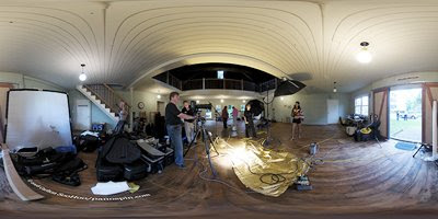 Photo © 2008 Carlton SooHoo
Ever wonder what it's like to go to a Joe McNally seminar? This is what it's like.
But honestly, a small still photo doesn't really replicate the full Joe McNally geargasm experience. No, sir. For that you need to see the 360-VR stitched panorama.
(Server crash in 3, 2, 1...)
___________
Thanks to Carlton SooHoo for the pic, and to Joe McNally for the constant inspiration.
-30-
Đăng ký:
Nhận xét (Atom)
