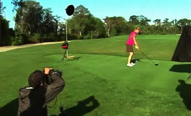
 Thanks to a tip in the Flickr threads I was able to catch this behind-the-scenes video done by Golf Digest during a recent shoot of Annika Sorenstam. I love these kinds of things, as there are always tidbits to be learned from watching other photographers work.
A little Googling (with a helpful assist from Golf Digest DoP Christian Iooss) hooked me up with one of the shooters, who was kind enough to expand a little on the lighting techniques. Links (heh) and details after the jump.
____________
The movie is not coded for embedding, so click here (or on any thumbnail image) to pull it up in a separate window.
The shooters are Stephen Szurlej and J.D. Cuban, and they have their work cut out for them. Here's the deal: You only get access to people like Sorenstam for brief amounts of time. And the magazine runs tips from her on a regular basis, so they need photos for each of those installments.
"Quick and simple is what we're trying to achieve," Stephen told me in a recent email. "When you've got Tiger or Annika for a couple of hours and the goal is to shoot every instruction tip or story for a years worth of issues, you've got to be fast. If you can get it done in a bit less than the allotted, time the players are pleased, and it goes that much easier the next time."
Eighteen shoots in 2 hours. Do the math: That's an average of six minutes and forty seconds per shoot, including lighting setup and moving to the next location. And you thought Annie and The Queen had it rough. (Annie got an average of 7.5 minutes...)
 Looking at the tape, the second thing you might notice after the torrid pace is that they are using two battery powered studio-level strobes - one in a soft box and one with a large, gridded reflector. The soft box is feathered way up, which gets soft light to the subject without blowing out the grass in the foreground.
 For most of the shoots, the soft box is at camera right, with the other light at back camera left as a separation light. And the sun is coming from directly behind the shooter, making it essentially and on-camera light. But that does not tell us what the photos will look like, merely because you can get drastically different looks from the same lighting setups by varying the ratios between the lights and the ambient.
One Setup, Several Looks
Take a moment to visualize a couple of different looks that would be possible from this lighting scheme. Say you are exposing for the ambient light. In that case you might drop the flashes down in intensity and use them as a crosslighting/fill setup. This would lessen your shadows and bring the tonal range of the scene into the range the camera's chip can easily handle.
Or, you might drop that ambient a stop or two to bring it down to the level of fill light. Then pump the scene back up with the feathered soft box and create a stark rim light with the gridded reflector. Two very different looks, just by altering power levels (and/or aperture and shutter speed.)
So, which did Stephen and J.D. do? Neither, as it turns out.
"We're using the main light as a fill to eliminate the shadows, trying for a pretty flat lighting," Stephen says. "If anything, we do underexpose the ambient -- just a bit, 1/3 to 1/2 of a stop. But the flash/daylight is pretty balanced."
What? All this setup just to make flat lighting? Why go to all of the trouble?
Simple. For a series like this, the most important thing is to make sure you get easily readable detail everywhere. This is not the cover, where you would want to create drama and a look to sell magazines on the racks. This is teaching. And more important than the feel of the photos is that they be extremely legible for those would actually like to learn what Ms. Sorenstam is trying to teach them.
Besides, when you are working so quickly, you are only gonna take a few frames of each setup. You need legibility on every frame, to further ensure that all 18 shoots will work.
"We have two lighting setups in the ready position," Stephen continues. "So as I finish, Annika walks over to JD's set up and the shooting is nearly continuous. Meanwhile, I relocate to the next location and set up while JD is shooting his tip or instruction story. I'm ready to go again when he finishes. Kind of aerobic leap frogging photography."
 About a third of the way into the video, Stephen nails a bunker shot on the first attempt. He credits this kind of thing to a mixture of luck and experience. But then, he's been shooting golf since back when they made the balls out of wood.
 So he's got that going for him, which is nice.
"Timing with digital cameras is still harder than film cameras," Stephen said. "I look back at images I shot on film, no chimping, and the ball is on the club more often with fewer takes. I definitely have a lower percentage on the club with digital. Of course, the fact that I'm shooting at 1/320th of a sec hurts maybe even more than the digital shutter lag. Back in the film days we most often used reflectors, not strobe."
Cover: Same Lights, Different Look
On less hectic days, they are able to work the light to get more of a look. "If we're doing just one location," Stephen says, "we have the luxury of using a 12X12 silk for a better look. But we just can't do that in this type of shoot. For a cover, yes."
Having enough watt seconds to own full daylight gives you options, no doubt about it.
This week, Stephen is busy humping long glass at Torrey Pines in San Diego, the site of this year's U.S. Open. So while you get to sit in the living room watching Tiger pick up his trophy on Sunday, you can feel sorry for Stephen -- all that walking around, inside the ropes...
___________
Further reading:
Golf Digest cover shoot: Slideshow
Không có nhận xét nào:
Đăng nhận xét