To understand how way cool it is to have been immortalized in one of UK shooter Mike Stimpson's Lego photos, you have to appreciate some of his other work. Mike is the guy who did all of those classic photos in Legos.
Bonus points for the setup shots he includes with most of his iconic reproductions, too. Make sure you click through the photo above to see the notes, too. There's some serious deets in there.
Eat your heart out, Mt. Rushmore. And thanks again, Mike!
-30-
Thứ Bảy, 28 tháng 2, 2009
2009 Save-the-Dates: Dubai, Paso Robles and Santa Fe Workshops
In late March / early April, I'll be teaching three classes at a new, expanded Gulf Photo Plus 2K9 in Dubai. More on that full line-up (and an amazing video) after the jump.
Also coming soon is a week-long intensive lighting workshop in California in late April, details of which will be posted shortly. And looking further out, I also will be teaching for the Santa Fe Workshops in San Miguel d'Allende (Mexico) in mid-October. More on those last two when the respective sites go live.
But Dubai is fast approaching, so hit the jump for more on that...
__________
GPP 2009
What can you say about Dubai that has not already been said? It's insane. But a picture is worth a thousand words, so check out what The Big Picture had to say on the matter.
I was there last year for Gulf Photo Plus '08, and I am looking forward to getting back for GPP 2009 at the end of the month.
Scheduled to teach this year: Zack Arias, Carol Dragon, Drew Gardner, Chris Hurtt, Chase Jarvis, Vincent Laforet, Bobbi Lane, Cliff Mautner, Joe McNally, Robin Nichols, David Nightingale, Asim Rafiqui and yours truly.
I'll be teaching three classes -- a two-day lighting seminar for beginners, an introduction to headshots class, and a two-day class on self-generated personal shoots with a purpose.
Which pisses me off, really, because I would much rather be off the clock and attending things like Laforet's three-day assignment class, or any of Zack's classes, or learning high-end HDR with David, or draping models on water buffalos with Drew, or anything with Joe. You get the idea.
Chase is even reprising his five-day soup-to-nuts commercial shoot course, too. Last year it was a huge hit -- one of those things that erases a few years of "school of hard knocks" from your career track. It is the full deal: A 360-degree look at a full commercial assignment, from creative brief to preplan to model selection to shoot to post. Everything.
Note that 5am - 8pm sked on the shoot day, too. Heh.
You'll Run Out of Adjectives
I know Dubai is a stretch for most. Would be for me, too, if they were not bringing me in. But if you are one of those lucky souls with some disposable income left, and live in that quadrant of the world, it might be worth a search on economy-depressed airfares into DXB. Emirates Airlines flies there -- in style -- from just about any major international airport. And the onsite hotel (next door, actually) for GPP is significantly cheaper this year because of those empty rooms, too.
If you are rationalizing the trip as a getaway with your significant other, Dubai is a shopper's paradise. (Or hell, depending on who gets the credit card bill.)
The Mall of the Emirates with the indoor ski slope now only barely cracks the top three offerings. My personal favorite is Ibn Battuta Mall, just one of the pavilions of which is pictured at left.
Of course, it has been almost a year since I have been to Dubai which means there is an all-new "biggest mall ever" -- the creatively named Dubai Mall. (Lotta thought went into that, I am sure...) I'll have to check that one out, along with Ibn Battuta again. Not that I am a shop-a-holic. I am mostly in it for the over-the-top cultural/capitalist/visual stimulation. And the air conditioning.
But Dubai's most Freudian attraction is, of course, the Burj Dubai. It will be the tallest building in the world (by a long shot) upon completion this year. If you ever do visit The Burj, skip the stairs and head straight for the elevators for the ride up. I'm just saying.
But for the ride down, you may wish to consider an alternate route:
__________
Links:
:: Gulf Photo Plus 2009 Main Page ::
:: Blog: Dubai Strobists ::
Lighting 101 PDF Released in Three More Languages
I am happy to announce that, thanks to the generous efforts of a dedicated group of multilingual readers, the Lighting 101 course has now been released into French, Hebrew and Spanish.
Hit the jump for links to the uploaded files, instructions on how to get L101 in other languages -- or maybe even translate it into a new one...
__________
Leading Off -- French
Thanks to the team effort on the French translation project, the L101 French version will thankfully not be a jumble of misconjugated verbs and insulting idioms. My French, she is not so good, non?
These guys did it by committee and were meticulous to a fault. I am told they deliberated over it until the last drop red wine was gone. Such dedication.
Thanks to Jacques, Mélina, Benoit, Charles, Christophe, Laurent and Jon, many hands made light work (owch - that pun physically hurt).
The PDF is available for download here. Not that it has to stay there, either. These PDFs are released for hosting/sharing anywhere, as long as they are unaltered and attribution is maintained.
Batting Left -- Hebrew
Thanks to the one-man translation machine, Tomer Jacobson, Lighting 101 is now available in Hebrew.
I had to hold my laptop up to a mirror to try to make sense of the right-to-left script.
Didn't help! But it looks beautiful and was a lot of effort for one person. You rock, Tomer.
That translation is here. As with the French version, feel free to pass it along anywhere you wish.
And at Clean-Up, Spanish
What else can I say about Rafa Barbera? He has been translating Strobist into Spanish at Strobist en Español since way back. So, naturally he felt he should take on all of the extra L101 translation and PDF formatting all by himself, too.
Having finished this task, he will next be solving the world's economic problems before moving on to single-handedly finding a solution for global warming.
The Lighting 101 PDF in Spanish is here. (Thanks Rafa!)
__________
Remember, a Japanese version is already available (over 4,000 D/L's from the MediaFire site alone) and of course there is an English PDF version, too.
If you want to learn more about the translation projects, start here.
And again -- many, many thanks to all of the people involved.
Thứ Tư, 25 tháng 2, 2009
John Keatley: Lighting Strikes Twice
On Monday I pointed to the blog at Redux Pictures as a great stream of visual stimulation that you can have delivered to your RSS reader almost daily.
Today, we chat with Seattle-based Redux photographer John Keatley, who photographed for two different magazines a hacker named Dan Kaminsky. You may remember the name -- Kaminsky was the guy who recently discovered a security hole in the entire internet.
This, and links to John's other recent work, after the jump.
__________
Same Subject, Different Day
John originally shot Kaminsky for Technology Review magazine, and then shot him about a month later for WIRED. You'd think, with those kind of publications backing you, that you'd have the subject at your beck and call for several hours.
You'd be wrong. John's first obstacle was convincing Kaminsky to stick around long enough for him to set up a light or two.
Okay, well, how 'bout a glamorous setting then? Can we at least get a really tech-looking environment?
Nope. How 'bout a sparse, mostly empty apartment with rented furniture. Say, a folding table and a couch.
But you're still shooting for a pair of very visual publications, so you have to step up and do something cool with it. Which is exactly what John did.
Dan Kaminsky, Take One
So Technology Review calls the day of the shoot to guide John toward shooting a simple head shot. Which is cool, because John has a thing for head shots.
John arrived at Kaminsky's apartment to hear that his subject had a meeting at Microsoft in, like, 45 minutes. Which is news to John, of course. But a little negotiation bumped his available time up to about an hour.
That still meant that he would have to tone down his normal approach, in which he uses about six lights to sculpt his subjects. But it was something, at least.
So he instead broke out four lights and in the end wound up using only three. He sat Kaminsky on a stool with a couple of blue kickers and a frontal key coming in from above the camera.
The fill light in the photo -- reflecting both the key and the blue separation lights -- was a pillow with a piece of paper on it being held by the subject. Hey, any port in a storm. And time was short.
(Click for bigger in a new window.)
"It was kind of a funny picture," John says. "He was sitting on a little stool, with about four couch pillows on his lap and a piece of paper underneath it. And I am controlling him to the millimeter."
Not exactly the picture of a glamourous set you might expect when shooting for the national mags, but it gets the job done.
John says that Kaminsky was really generous with his time -- what little he had. He tried to make good use of the limited time by coaching Kaminsky through a series of expressions. And in the end it was the wry, sideways glance that carried the photo.
"I shot a lot of stuff," Keatley says, "but this is the one that jumped out at me."
Dan Kaminsky, Take Two
A month later, when WIRED did a story on the security breach, John again got the call. Same bare apartment -- save a couch, card table, some guitars, etc. -- and the same subject.
John was doing a little straightening up for the WIRED photo and saw the dumbbell in the corner and decided to leave it in. Every little detail left in the photo is part of the narrative. The router, for instance, is being held together by tape. Perfect.
Kaminsky, again, said he had a meeting with Microsoft in an hour. Which was a little disconcerting, as WIRED was looking for several options as opposed to just a nice head shot.
To make things more interesting, this was his first shoot with a new MF digital back. You know, just to make things a little more complicated.
So he began working through different looks for the room, moving things around. (Good portraits are said to be 10% photography and 90% moving furniture.) John said he moved his environmental elements around until he ended up with a photo he could sit back and look at with contentment.
That's a great way of articulating it, really, as your photos are either going to make you content or pissed off later. And it all depends on how well you take care of the details before you make the picture.
Okay, so the top picture is a little more flashy and has that great expression going for it. But I have to say that I really love the WIRED shot above. The sparse environment, the lost-in-thought expression, the nuanced light. (Click to see it bigger in a new window.) These are the kinds of pictures I spend serious time on when I see them in a magazine.
"Typically what I do is I start with my key," John says. "I decide the shaping that I want. For this one I was using a spot grid to create shadow."
The gradients are all from the light -- not Photoshop. The gridded key is coming in from hard left. For fill, he used a soft box coming in from over his left shoulder, and the finished out the fill with a couple of umbrellas for a total of four lights.
He started with the key for shape, then kept bringing up the soft box and umbrella fill until he got the contrast that he wanted. The idea was for the light to be soft, and still have some contrast.
John has a mix of Elinchrom Rangers, which he loves for their power and portability. These are augmented with a growing arsenal of Profoto Acutes. It may sound excessive, but shooting with a medium format Hasselblad H3D2 at lower ISOs requires lots of light to carry depth of field.
He says has been leaning towards the Profotos lately, because he prefers the reflector mounts and their faster recycle times when compared to the Rangers. Also, the Profotos are well-represented in the rental houses, which is important when he travels.
Saving the Best for Last
John has recently begun blogging about his shoots. The blog is evolving quickly, and is definitely RSS-worthy. IMO, the more shooters doing this at John's level, the better.
If you're smart, you'll only believe half of what you read in his blog posts. If you're really smart you'll know which half to believe, as John weaves a pretty constant stream of BS. Any person who shoots serious photos without taking himself too seriously is aces in my book.
You can also see John's full portfolio on his main website, here.
__________
Photos © 2008 John Keatley
Chủ Nhật, 22 tháng 2, 2009
My Daily Ritual: A Nice Steaming Cup of Redux
A lot of people start the day with a cup of hot coffee. I prefer to get my caffeine from Diet Mountain Dew, but you can't really hit that before lunch or you look like an addict. (I can quit any time -- I quit seven times last year alone.)
So, my morning pick-me-up is to cruise over to the Redux blog. It's run by Myles Ashby, and in it he offers a steady stream of published work by the very talented shooters at Redux Pictures.
There is no faster way to grow as a photographer than to consume a steady diet of good photography -- and take the time to try to understand which qualities in those photos appeals to you. I am into location portraiture, so Redux is a great fit for me.
Myles' approach is simple. He scans the tear sheets, runs the pictures all the way across the editorial hole, then tells you who shot them and where they ran.
Redux is a wonderful boutique agency which is part of a network of similarly minded agencies around the world. Bonus: If you do a little clicking through on the main site, you'll probably end up looking at cool photography until 3:00 a.m., like I did the first time I explored those links.
The Redux Blog is 100% photography -- like opening the fridge in the summer and scooping out the center of the watermelon and leaving the part with all the seeds for everyone else. In fact, the only way it could be better (for me) is if Myles spent a few paragraphs on each post breaking down the lighting.
But I'm a niche market. And besides, I have been talking with a couple of Redux shooters about just that. More TK.
Link: Redux Blog
(Photos by Robyn Twomey [top] and Tom Wagner.)
-30-
Thứ Năm, 19 tháng 2, 2009
Idea: SB-III Barn Door Mod
I have played around with the LumiQuest Soft Box III enough now that it is one of the few light mods I always pack if I am gonna be shooting people. You don't use it like a normal soft box -- you want it in real close, so it gets softer and is powerful enough to overpower the sun.
But I also noticed that one of the things I love about it is that fast fall-off you get when working in very close, like in this photo, shot for the ad. I love that soft light with fast fall-off so much that I have often found myself enhancing the fall-off with a nearby gobo.
This shot, if you'll remember, used the slightly smaller SB-II right overhead and a gobo in really tight to keep the light off of the top of his head. (A little fill was added in, too -- more here.)
And when I use two SB-III's as rim lights I tend to put them in close enough so that I have to worry about lens flare. So I usually have to gobo them there, too.
That got me thinking: If I am usually gobo'ing the light anyway, why not just build a single barn door into the unit itself? Saves a stand and a clamp, right?
Equal Parts Cardboard and Gaffer's Tape
I wanted the flap to be adjustable, retractable and to fold flat along with the SB-III when packed. So I just covered some cardboard with some black gaffer's tape and attached another strip lined with Velcro to secure it at the chosen angle.
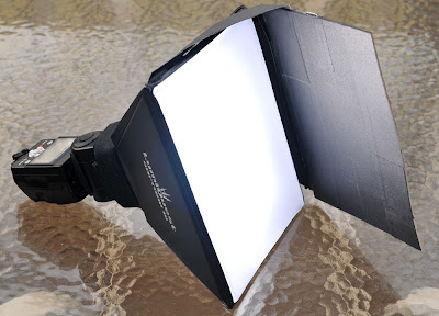
Nothing fancy. The "hinge" is made out of gaffer's tape, too.
In addition to two ways listed above (blocking rim flare and shielding the top of someone's head from a nearby top light) I'm betting will most often use it to make a shaft of soft light for close-in, TTL flash portraits.
Holding the camera in the right hand and the light source in the left hand makes a nice cross light to back/right sunlight. And if you can gobo off the light as it works around the (camera left) side of your subject's head, you can definitely do some very cool stuff with nary a light stand in sight.
-30-
Thứ Ba, 17 tháng 2, 2009
Nifty Three-way Flash Bracket at WPPI
Cool little triple flash bracket from Lastolite, the "Triflash," is being shown on the floor of WPPI this week. Being a Bogen Imaging product, I can only think McNally had something to do with this. Not available yet, so we'll have to wait a bit.
Looks very useful (and small) for spreading a decent amount of speedlight juice into an umbrella. You can mount one, two or three strobes easily.
I am liking the clamp. But my favorite thing about this photo is that someone is actually making fake speedlights for displays now. Just like the fake TVs in the Ikea showrooms. We've arrived.
[UPDATE: No, we haven't. Those are apparently Metz strobes, as per the comments. Sigh.]
More info: Lastolite Triflash
(Thanks to Curtis Joe Walker for the heads-up.)
-30-
Thứ Hai, 16 tháng 2, 2009
PocketWizard FlexTT5 and MiniTT1: Full Review
PocketWizard had been noticeably quiet recently while the flash remote landscape continued to evolve with new technology. But today they re-set the bar in announcing their new flagship models, the Flex and Mini.
And while they do work perfectly well as garden-variety remotes, they bring some ultra-cool capabilities that go well beyond manually synching an off-camera flash to your camera.
I have been a PocketWizard user since the very early days, and was lucky enough to be in the loop for early testing. To be honest, I am still a bit wobbly-kneed at some of the things the new ones can do.
Unfortunately for me, they decided to go with a Canon-specific model first. So I felt a little like I was working in a foreign language while I was test driving them. Not to worry, as Nikon-compatible models are reportedly on the way.
In a nutshell, the system rocks. And if you are a Canon shooter who already uses PocketWizard remotes, you are going to want to at least grab either a Flex or a Mini very soon -- mostly because of one very special feature. More on that below.
Full info dump, after the jump.
Flex? Mini?
First off, to avoid and confusion, the "MiniTT1" unit is the camera-top unit. It is very small and has an internal antenna.
It uses a CR2450-size (or CR2354) 3v button cell, but is designed to be very stingy on power usage. There is an auto-off feature that shuts it down whenever your camera goes to sleep. This allows a ballpark battery life expectancy of "hundreds of hours" according to PW.
That said, these are not batteries you can find out in the middle of nowhere. They might not necessarily be in stock in your local Target or grocery store kiosk. In quick checks I have found my local outlets to be hit or miss.
Radio Shack does carry the them, but my local store only had two in stock. However, given the battery life expectancy if you keep one spare in your bag you should be fine.
The "FlexTT5" is the unit that would be located at the flash (or remote camera) end. It is bigger and runs on AA's. Alkalines are recommended, but Ni-MH's worked fine, too. Battery life is around 60 hours of use with alkalines.
The Flex also can serve as a camera-top model, and can do everything a Mini can do. So if size is not as critical as is readily available power sources, some may opt to go with all Flex models instead of a Mini/Flex combo. But the Flex is expected to cost about 10% more than the Mini.
The antenna for the Flex is external and folds out, revealing the USB port used for custom configurations. More on that below.
Both units have pass-through, full TTL contacts in a hot shoe format. Which means no more PC cords needed for hooking them up to speedlights. In other words, your SB-600 (no PC jack) and every Canon flash other than the 580 EX II, (which already has a PC jack and did not need a hot-shoe hook-up) just got a whole lot more useable in both manual remote and remote/TTL modes.
Most Nikon flashes were always easier to use off-camera because of the PC jack, but now PocketWizard has helped to level the playing field for Canon.
They are both solid in their construction, and the Flex has an integrated 1/4x20 mount. It is low-profile, and will not screw up your flash alignment in an umbrella. For purists, it would be very easy to fashion a bracket that would put your flash right next to the umbrella shaft. But the Flex is low profile and also removes the need for a cold shoe in an umbrella setup, so I would probably just use it straight.
Here's a blessing and a curse for the Flex: It can double as a makeshift flash stand when a speedlight is mounted to it.
Why is this a curse? Because the TTL contacts basically serve as one of the balance points on the bottom. This could be problematic, but a protective workaround should be easy enough. You know you are gonna use it that way on occasion, so just be careful to take care of those contacts.
Slightly Ahead of Their Time
Okay, may as well start with the headline feature: They do remote TTL, and they do it well. They call it "ControlTL," and it is technologically very different than the way the RadioPopper handles remote TTL.
In fact, while testing it was generally my lack of familiarity with Canon's E-TTL system that proved to be the limiting factor, not the Flex/Mini itself. I was using a Canon 40D and a kit zoom lens, with 580-II's and 430-II's. And being a Nikon guy, felt very much like a fish out of water with that system.
It was as if someone had invented barbeque ribs that were actually good for your heart, but they only were effective for women. Incidentally, some of you EXIF scrapers noticed that I had been shooting with Canon when I posted in Flickr. This is why. And no, I am not switching.
Range in TTL mode is 800 feet, and they can trigger a standard (manual mode) PocketWizard from up to 1,200 feet away. I did not have enough line of sight distance to best it, but range and reliability have always been a PW strong suit.
As far as remote TTL shooting, the area lit by the flashes will be the limiting factor more than the range of the Flex and Mini themselves. That is to say that a flash placed a couple hundred feet away in TTL mode would likely be lighting a small enough portion of the frame to stress the metering system of a TTL system, anyway. Suffice to say that for just about any practical TTL challenge you can dream up, these should fit the bill.
Engineering-wise, there is some very sophisticated communication going on behind the scenes. The PW's actually intercept the crosstalk between the camera and flash by acting like a flash on the hot shoe.
The camera sends a series of signals back and forth that precede the flash's firing. It's this head start on the flash's actual firing that allows the Mini and Flex the time to communicate via radio the information needed to set up the TTL sync. Or at least, that's how I understood it when PocketWizard engineering guru Jim Clark first explained it to me over dinner at an Italian restaurant last fall.
There's a LOT of tech in there. He was talking about the split-second communications protocols in DSLRs, HyperSync offset, instantaneous quantum data transmission (not an actual PocketWizard project -- yet), etc. After a while, my mind started to explode a little. I half expected him to levitate a bottle of Chianti with his superhuman engineering brain.
Wrestling with Off-Camera TTL
But all of this was just spec talk. What matters is how they work in a real-world environment. So I called my friend Justin Kase Conder, (who shoots Canon) got him NDA'd, and went out with him to shoot some high school wrestling.
The gym was lit with vapor lights -- not really close to anything in the fluorescent range. So we greened three Canon flashes and dialed the camera's white balance around until they looked close on the camera screen.
We stuck the three Flex-equipped flashes on stands in a roughly triangular pattern around the mat and let the TTL drive the flash exposure wirelessly. Our ambient exposure was set to underexpose the room by a couple of stops, so areas that were not lit by flashes would not be pitch black.
As I said, I'm no Canon E-TTL whiz. So I kept it simple and stuck them all on the same channel. As far as the camera and PW was concerned it was a single TTL flash firing from three different locations.
The camera and PW Mini/Flex platform did just fine. Any variations I saw in exposure appeared to be as a result of Canon's E-TTL system, which acts pretty differently than what I am used to with Nikon. For instance, if we zoomed way out and the subject matter was very small in the frame, it might get a little hotter as the camera tried to compensate for the metering. Normal TTL stuff to consider.
In fact, the PW remote TTL did very well, except that when we started aiming close into the backlights the flare would walk the exposure around some. That is normal for TTL flash, too, so I suspect the variations had very little to do with the wireless platform itself.
For a shoot with some decent flash distances, it worked very well on total auto. I am really looking forward to getting the Nikon version and trying it against a more known (to me) quantity of a TTL flash system.
High-Speed Focal Plane Flash Supported, Too
The Flex/Mini system is essentially transparent when working in focal-plane, high-speed sync.
This is a very power-hungry technique for the flash, because of the pulsing nature of the FP mode. So keeping a short flash-to-subject working distance is important. With the Flex/Mini system, for example, you can shoot a long-lens TTL, hi-sync portrait in midday light and back the camera way up while keeping the flash in close to the subject.
(UPDATE: This is demo'd in the PW video, just added at the end of the post.)
This is something the RadioPoppers will do, too, but that system approaches the synching sequence very differently than do the Flex and Mini.
Alright, so it does TTL and does not need a PC cord at the flash end. But I shoot manual, and my flashes have PC jacks on them. So none of that is going to be enough to crack open my wallet. But then they hadda go and do this:
The NSA Folks Would Be Proud
I live very close to the National Security Agency (NSA), which is jokingly referred to as "No Such Agency". The NSA gathers intelligence by eavesdropping and intercepting electronic signals. So they know things.
Well, the new PWs "know things," too. Remember how they can replicate the whole light-based wireless TTL operations by jumping the signal timing on the camera-to-flash pre-chatter? Well, what else could you do if you knew the camera was about to fire your flash?
You could tell the flash to fire a little smidge early, is what you could do. And if you could vary the timing on that signal, you could squeeze an extra stop of shutter speed out of most cameras' sync, too.
We're not talking focal plane synch, with its power-robbing pulses, either. We are talking about using that timing jump to lose the tiniest portion of the energy in the "ramp" of the flash pop. Efficiency-wise about 95% of the flash energy is getting through -- but at a full shutter speed higher.
Adding a stop of shutter speed in an ambient environment means that you can open up a full stop of aperture to get the same exposure. Since your flash cares only about the f/stop, it effectively gets (almost) twice as powerful with the more open aperture.
Alternatively, you can use the extra stop to drop the ambient more, as in when you are balancing out in the sun. Long story short, the Mini (or Flex) increases the sync speed of your existing cameras which effectively makes your flashes more powerful.
How can they do this, given the fact that different cameras have pre-sync timing sequences?
Simple -- they let you control how much the "HyperSync" jumps the camera's timing sequence. They call it a HyperSync offset, but I call it magic. You can get in there and adjust the timing, in microseconds, to experiment and find the setting the best suits your camera and flash.
The HyperSync mode works on full-frame cameras, which have the least margin for error. So in theory, at least, it should work even better with the small-chip cameras, which have more wiggle room around the edges of the chip.
It's only a matter of time before the message boards start lighting up with best settings for every camera and flash model combos to rack the full sync out as far as possible. As the best tested numbers come in, I'll keep a running tally here. Gawd, I love the internet.
Old PW Users Don't Get Hosed
The new system works in manual -- including the HyperSync feature -- with the old models, continuing PocketWizard's tradition of backward compatibility. You simply configure the mini to any one of the previously existing 32 traditional PW channels (supports the MultiMAX channels, too) and you are ready to roll.
But you can also walk the HyperSync offset number around and get significant improvements in any camera system that uses your current PocketWizards. That's why I think many people will be snatching up a single Flex or Mini (either will do this) right of the bat. You do not have to be a remote TTL shooter to get a big benefit from the system.
Note that you cannot change legacy channels on the fly -- they need to be changed in the utility program. And speaking of the utility program, you can pre-load two configurations into each Mini and Flex. The "C1" and "C2" settings are entire multiple configurations, not just triggering channel selections.
So it's easy to have a HyperSync setting built in for, say, both your speedlights and your monoblocs. They will have different sync lead times and thus different hypersync settings. But you can easily switch between them on the fly. (You could also use the two configurations to have different legacy channels ready to go on the fly.
For me, the idea of turning all of my cameras into faster-sync bodies is reason enough to jump on a Flex or Mini right away. And I would, if they had a Nikon-model Mini ready to go. (Grr.)
But I do understand why they have to have different Minis and Flexes for Nikon and Canon -- the TTL pin configurations are different. (The firmware and config utility handles variations on individual camera and flash models, so one physical design per camera brand is all that is required.)
TTL Uzi
One more thing. Since the camera is bypassing a lot of the optical flash pulse timing sequences (it sees the Flex or Mini as a single, on-camera flash) you can actually shoot TTL, off-camera flash at up to 8 frames per second. Your limitation will be that you'll have to be at low enough power so the flash itself can actually keep up.
But the whole system is capable of delivering those speeds while monitoring the TTL info at the same time, which is pretty impressive.
And overall, it is important to know that the Flex/Mini is not so much a physical device as it is a configurable, programmable universal platform. So look for new capabilities to be popping up for them in the future.
Price is not exactly in the eBay remote neighborhood. It is expected to be about 10% more than the current PW II's for the MiniTT1, and 20% more for the FlexTT5. But again, you do get backward compatibility with your existing PW's.
UPDATE: PW has put up a promotional video on the Flex and Mini which hits all of the main points:
__________
More information i s available at PocketWizard. Prices TBA, but the Mini is said to be about 15% more than a Plus II, with a Flex coming in at a little higher than that. (UPDATE: $199 for the MiniTT1, $219 for the FlexTT5.)
Here's a bit of a bummer: US and Canadian markets only for the time being. I am trying to run down any info I can on that, and also a link to an online product manual. (UPDATE: Product manual here.)
Also, this discussion thread started early in the morning, as soon as they started slipping the new pages into the PW website...
Lastly, over at the PocketWizard Blog, Matt is accepting questions about the capabilities of the new Flex/Mini platform. I suspect he will get a few. Don't be a doofus, though -- check out the product manual (linked just above) first.
Thứ Bảy, 14 tháng 2, 2009
Pass the Kool-Aid, Please...
Just saw the Feb. 2009 issue of Practical Photography for the first time. It is produced in the UK but has just made it to my local Border's. They did a cover and 14 pages (!) on off-camera speedlight shooting.
The mag featured lots of shots with diagrams, gear choices, photos by Strobist readers, a few by yours truly and some way coolBMX mountain biking shots by Adam Duckworth.
They even called every last one of you a fanatic, yes they did. The nerve. Just because a few people wear long, white robes at meetups, makes us some kinda cult?
(No worries if the pudding tastes a little funny -- we got a comet to catch, people...)
On US newsstands now, and worth a flip-thru.
-30-
The mag featured lots of shots with diagrams, gear choices, photos by Strobist readers, a few by yours truly and some way cool
They even called every last one of you a fanatic, yes they did. The nerve. Just because a few people wear long, white robes at meetups, makes us some kinda cult?
(No worries if the pudding tastes a little funny -- we got a comet to catch, people...)
On US newsstands now, and worth a flip-thru.
-30-
Thứ Sáu, 13 tháng 2, 2009
Breaking: PocketWizard Begins the Strip Tease
It ain't much, but I am sure it'll be enough to get the speculation started around these parts. More coming Monday, of course.
-30-
-30-
Thứ Năm, 12 tháng 2, 2009
Winter Treat: Frozen Hummingbirds
(No, not for eating. By the time you pluck and de-bone 'em, there's not that much left, anyway...)
__________
Okay, so maybe you can't light up Grand Central Station with a few speedlights. But if your subject is two inches long and flaps its wings 50X a second, speedlights rock.
For one, you can keep dialing a speedlight down to get insanely fast flash durations (1/25000th of a second, anyone?) which effectively becomes your wing-stopping shutter speed when you overpower the ambient.
That's what reader Pat Hunt did, anyway. Hit the jump for his setup, and more amazing hummingbird photos.
__________
He's Got The Beat
At 50 beats per second, you have to remember that you are talking about an entire wing flap cycle during that time, so a 1/25000th of a sec flash duration is going to comprise about 1/500th (give or take) of a flap.
That's enough to almost freeze the wings. IMO, the "almost" part makes for a more interesting image, too. Incidentally, that 50BPS is in the same frequency range as a mid-range bass note coming from your stereo, which is why you hear the wing beats as a low buzzing tone.
Here's the setup (click for bigger):
He's using four speedlights ('800's and '600's) to essentially surround the bird. He's using CLS to fire them all (piece of cake at close range) and has them dialed down to 1/64th power minus an additional third of a stop.
Pat even used an umbrella swivel to hold the feeder. Style points for that.
The exposure is a balancing act, in more ways than one. First, if you want the black background you have to get your flash exposure well above the ambient. (Or you could always stick a piece of poster board in the background, as Bradford Fuller did.)
But you do not want to waste any of that flash power, as each notch up in power costs you some flash duration. Pat used a normal, 1/250th sync because it was sharper than the pulsed flash of the higher-speed FP sync method. He also uses an umbrella to shade the scene from ambient light if the sun is at a bad angle.
Other particulars: No exposure compensation, low ISO for latitude, and a little juicing in the RAW converter to make it pop.
Regarding how the pre-flashes affect the birds, Pat said, "It varies with species. The chickadees and hummingbirds don't care much about the preflash or flash proper unless they are jumpy for other reasons. The jays are a whole different class of intelligence and paranoia and are extremely sensitive to whether belligerent neighbors are nearby."
He goes on to say that they took great care not to molest the birds, even to the point of giving them lots of runs at the food without popping the flashes.
Here are some more of Pat's images (mouseover for full frame):
Created with Admarket's flickrSLiDR.
If this doesn't work for you (it can be a little hinky) click here for Pat's Flickr set.
__________
Speaking of Hummingbirds
Here's something you don't see every day.
Emily had a special hummingbird treat when we visited Costa Rica last month. I never would have thought they would light on her hand like that, but it happened three times.
She has always had a way with animals of all kinds. Kind stays perfectly still, and assumes they are willing to make friends at any given moment.
Of course, Pat's multi-light setup makes my on-camera-flash, point-and-shoot shot look pretty lame. But still...
__________
Okay, so maybe you can't light up Grand Central Station with a few speedlights. But if your subject is two inches long and flaps its wings 50X a second, speedlights rock.
For one, you can keep dialing a speedlight down to get insanely fast flash durations (1/25000th of a second, anyone?) which effectively becomes your wing-stopping shutter speed when you overpower the ambient.
That's what reader Pat Hunt did, anyway. Hit the jump for his setup, and more amazing hummingbird photos.
__________
He's Got The Beat
At 50 beats per second, you have to remember that you are talking about an entire wing flap cycle during that time, so a 1/25000th of a sec flash duration is going to comprise about 1/500th (give or take) of a flap.
That's enough to almost freeze the wings. IMO, the "almost" part makes for a more interesting image, too. Incidentally, that 50BPS is in the same frequency range as a mid-range bass note coming from your stereo, which is why you hear the wing beats as a low buzzing tone.
Here's the setup (click for bigger):
He's using four speedlights ('800's and '600's) to essentially surround the bird. He's using CLS to fire them all (piece of cake at close range) and has them dialed down to 1/64th power minus an additional third of a stop.
Pat even used an umbrella swivel to hold the feeder. Style points for that.
The exposure is a balancing act, in more ways than one. First, if you want the black background you have to get your flash exposure well above the ambient. (Or you could always stick a piece of poster board in the background, as Bradford Fuller did.)
But you do not want to waste any of that flash power, as each notch up in power costs you some flash duration. Pat used a normal, 1/250th sync because it was sharper than the pulsed flash of the higher-speed FP sync method. He also uses an umbrella to shade the scene from ambient light if the sun is at a bad angle.
Other particulars: No exposure compensation, low ISO for latitude, and a little juicing in the RAW converter to make it pop.
Regarding how the pre-flashes affect the birds, Pat said, "It varies with species. The chickadees and hummingbirds don't care much about the preflash or flash proper unless they are jumpy for other reasons. The jays are a whole different class of intelligence and paranoia and are extremely sensitive to whether belligerent neighbors are nearby."
He goes on to say that they took great care not to molest the birds, even to the point of giving them lots of runs at the food without popping the flashes.
Here are some more of Pat's images (mouseover for full frame):
Created with Admarket's flickrSLiDR.
If this doesn't work for you (it can be a little hinky) click here for Pat's Flickr set.
__________
Speaking of Hummingbirds
Here's something you don't see every day.
Emily had a special hummingbird treat when we visited Costa Rica last month. I never would have thought they would light on her hand like that, but it happened three times.
She has always had a way with animals of all kinds. Kind stays perfectly still, and assumes they are willing to make friends at any given moment.
Of course, Pat's multi-light setup makes my on-camera-flash, point-and-shoot shot look pretty lame. But still...
Thứ Hai, 9 tháng 2, 2009
Hanging Loose with Bil Zelman
Around here we sometimes get bogged down in the technical aspects of light. That's okay. This is a niche site and we are not trying to be all things to all people.
But balance is important in photography, even in the technical stuff itself. So today, we are going full-bore non-technical by visiting with San Diego-based photographer Bil Zelman. His airy, moment-oriented photos are loose, honest and have an unscripted, natural feel to them.
It's almost as if he whips out the old 127 film camera from the '70's, fires from the hip and all of the planets line up. Except that Bil puts a lot of work and conscious thought into making sure all of those planets line up right when and where he needs them.
Video, pix and Q&A, after the jump.
__________
I was introduced to Bil's work through an excellent interview in A Photo Editor. In it, he talks about why he engages in pro bono work for selected charities, and what he gets out of it.
I encourage you to check out the interview, even if you do not think you are interested in that type of work. He makes a great case (much better than I did) for the mutual downstream benefits, which are significant.
Appropriately, Bil's style is one that can flit effortlessly between his pro bono charity work and high-end commercial work. Take a look at the following video to get a sense of who he is before hitting the Q&A below.
__________
Q&A
When we spoke earlier on the phone, you mentioned that your initial focus on a shoot is not on light but rather on determining the emotional needs of your subject. You also have very little time in many cases. What kind of an intersection are you looking for during those few initial moments? Are you well-researched or winging it?
Every shoot has different needs. If you're shooting someone with a tight schedule, as celebrity personalities usually have, you've got to be prepared to get a great shot in 10 or 20 minutes -- regardless of how they feel.
It's usually impossible to gain someone's trust in 20 minutes, both in real life and on set. But I try to be genuine and involved in their part of the process as much as possible -- even if it's not necessary. Helping them to make wardrobe choices and showing interest in what color eye shadow the stylist is going with are tiny, easy little things that let people know that I really care about making this photo. And they’re that much more likely to trust my opinions later if I'm pushing them to do something unexpected.
Knowing current things about the person really makes small talk that much easier, and I do try and hold conversation while shooting whenever possible. If what I'm doing is so technical that I can't entertain them, I'll sometimes have a trusted assistant ask them a question or hold their interest. On my first shoot with Taylor Swift, I actually brought a friend of mine who is a guitarist and the two of them ended up playing while I shot.
Shooting good portraits is equal parts psychology, trust and technical expertise -- with the technical part probably being the least important. (I'm going to get hate mail writing things like that here huh?).
Your shooting style is loose and natural, and yet the light always seems to to be working for you in lots of subtle ways. Can you talk about why you frequently prefer to use dark cloths for subtractive lighting rather than working above the ambient with strobes?
For one thing, it's easier and often faster to set up a few black cloths than to drag out the packs, heads, modifiers, run power cables or generators etc.
I easily own $25k in lighting gear -- Speedotrons, Dynalite, Elinchrom gear etc, -- and often pack it all into a cargo van and bring it along just in case. But the best results are often found more simply. If I can find nice flat light, and sculpt it into something more contrasty and dimensional, it looks a lot more natural. I don't have to worry about staying within shutter sync or using ND filtration to knock things down, waiting for recycle times or having all those incredibly annoying flashes going off and ruining the mood. (Sorry Strobists!)
And don't get me wrong- There's a time and place for strobe, but it's only a tool and there are lots of other ways to work. In order for me to achieve a very natural looking light source with strobes and still have room for my subject to move around, I'd need HUGE light banks like the ones car shooters use.
I remember that you specifically had it in for "green uplighting," as you called the light reflecting off of grass outdoors. That is to say that you love to kill it with a dark cloth on the ground. Can you really help shape someone's face with just a black cloth on the ground?
Absolutely. Everyone ends up shooting in mid-day sun and positioning their subject in the shade of a tree at sometime or another. When that person's standing there they have two light sources: The blue light coming from the sky above and a bright green light coming from the sun hitting the grass below. You can't color balance for them both. What ends up happening is you set your white balance or filtration to warm the scene and take out the blue main light, and leave this bright green "up light" under their chin and in the sockets of their eyes, etc. I see it all the time in print.
Throwing a cheap black cloth on the ground in front of them not only corrects the color issue, but it also gives the lighting more contrast on the vertical axis. Which, in turn, gives everyone a better looking chin line, which makes people look thinner, etc.
Ideally, in this situation I'd throw an 8x8 cloth on the ground and set two black 6x6 scrims on either side to bring out their cheek bones. This configuration is the one use on the Tommy Shaw portrait and the blurry female model as well -- both of which were shot in backyards in "normal shade".
For the record, I had a sail maker sew pieces of black Duvateen together into 8x8, 12x12 and 18x24 configurations, along with grommet holes every 16 inches which can then be tied to regular background stands and raised. Scrim Jim makes great frames, although they're pricey and there are other options. You could buy black cloth anywhere and have someone hand hold it, throw it over two ladders -- whatever. The camera won’t know you didn’t have a sail maker sew them up.
Also, black felt is actually shiny at a forty-five degree angle and doesn’t work very well. Stick with the dull stuff the movie industry uses like Duvateen if you can.
One thing you said in an earlier conversation really stuck with me: "Focus is overrated." As a long-time news / sports shooter, that kinda made my head explode a little. But at the same time, the look resonates. What is it that will make you decide to veer so far away from convention on a shoot? Do you play it safe and shoot both ways? That must take a lot of confidence in your personal vision -- how do your clients react to this?
This brings a smile to my face. One of my best commercial clients has often offered to pay me more if I’ll make more of the images sharp. But I still like to shake the camera...
As far as blur goes there are all kind of beautiful things you can do with it. (But please, no more 1995 ”pop-the-flash-and-drag-the-shutter stuff”). You see it in great work everywhere from Richard Avedon to Sally Mann to Robert Capa.
Like anything, it’s a style thing. Standing still and racking your lens out of focus probably won’t be very interesting. But if you're walking backwards and you're subject is waking towards you and you're shooting at a 30th with a 50mm, you’ll probably get frames where the person has motion blur and the background doesn’t and vica-versa. This can bring a lot of excitement to a shot, separate the subject from the environment and also give your subject something to do other than stand there and look at you. Make your subject DO THINGS.
One of my favorite looks is shooting T-Max 3200 and shaking the camera while I shoot. The image comes out soft, but the large grain gives your eye something to focus on when you’re viewing the print. Visual texture is something fine print makers used to talk about all the time, from grain structure modification with developers to darkroom paper choices. But most of those things are now overlooked. Blur can be one of them.
I’ve kept my Nikon D2x solely for it’s awful noise at high ISO for just these reasons. It can be painterly and gorgeous with the right subject matter.
In general, many of your photos are stripped of the Nth-degree technicals and are built entirely on emotion and moment -- a leap of faith that is impossible for many photographers to make. How did you make that jump? A little at a time, or all at once? How has it changed you?
You know, this is so hard to answer!
I’ve always shot very quickly and playfully with a lot of direction and background changes. I don’t believe that there’s a single image on my website that’s been cropped at all, and I’ve always been that way.
I take the kind of photos that don’t really need much screwing around with, I suppose. And I wouldn’t be the guy to do it if they weren’t. Photoshop was something I resisted using for years, but I’m now pretty good with it and clean things up and sometimes remove things and such. But I would never use it to try and make a dull photo interesting -- which we now see a lot of.
People have been making remarkably impactful images for 150 years without HDR or high pass filters and I suppose I’ll end up being one of them. Perhaps I’m boring?
Don't take this the wrong way, because it is meant as a compliment: In many ways, your work has evolved (or maybe regressed?) into a look that is almost childlike. Like those projects that give cameras to a group of kids and edit the take down to beautiful work that is free of convention and restriction. If you could talk to yourself as a photographer 20 years ago, what advice would you give?
Can we say naiveté in place of childlike? I once had an art history professor refer to the naiveté of Julia Margaret Cameron's work and I thought it to be so poignant. I don’t believe I’ve even thought of that moment until now, but it’s interesting because she played with focus and blur and time exposures and was largely ridiculed for it. But try and purchase one of her photos now!
I suppose I’ve always wanted to believe that some photos are real, and leaving in a few mistakes and not being technically obsessed helps me with this. It’s almost as if I’m documenting my own photo shoots if that makes any sense at all? Method acting and letting people be who they are. (You can actually see one of my black cloths and stands in the blurry shot of the girl...)
If I had to give advice to anyone at all, it might be to know your tools inside and out, but not let them get in the way. I can go from a 125th to a 30th and from f2.8 to 5.6 while walking backwards and holding conversation without missing a beat. Add too much more to that equation and I’m paying more attention to my gear than to my subject -- not a good thing.
That, and take lots and lots of pictures.
__________
See more of Bil's work at Zelman Studios.
(All photos © Bil Zelman.)
Thứ Năm, 5 tháng 2, 2009
MVI: Q 'n A
UPDATE: Not meaning to confuse, and judging from the comments, I certainly did: Not really talking about the absolute number of comments, but rather the relative number on different types of posts.
__________
Without any true metric to understand how posts on Strobist are received, I sometimes revert to judging by the number of comments received on a particular entry.
Going by the (relative) numbers on different types of posts, this can be a little disconcerting.
Example:
Full, On-Assignment-style Monteverde Institute post: 24 comments.
Flippant, snarky Annie / Sean Connery video repost: 107 comments.
If I went straight by the numbers, it would be no better than those city mags that track rack sales to the point where every issue eventually morphs into some variation of, "50 Top Doctors!"
But against those raw comment numbers you have to consider relative quality of the comments, and those from the MVI post included some pretty good questions. So that helps to balance things out.
Hit the jump for some selected Q's (and, to the best of my ability, the A's) from the MVI post comments...
__________
Q and A
Leading off, from Anonymous:
How do you make the flash fill so balanced? This picture is so natural that I have hard time to reverse engineer the light.
Anon-
That's mostly because I am going so tight on the flash/ambient ratios. If you think about it, I am not so much lighting as compressing the contrast range of the photo.
If I had brought the ambient light way down, the lit area would be more obvious. But if you expose the photo in such a way that the exposure is built on making the ambient look just a little more saturated, you can build the subject back up with strobe without making the photo look obviously lit.
In an ambient-light-only photo, I would have to choose between a properly exposed Dan and properly exposed surroundings. If I exposed for Dan, the backlit surroundings would be too bright. So all the light is really doing is allowing me to compress both Dan and environment together into one lush exposure.
It looks natural because it takes a scene with a little too much tonal range in it and compresses it down to the way your eye normally sees it. In that way, it probably looks more "available light" than it would have if I only shot it with available light.
__________
Joe asks...
I'm starting Lighting 102 but am up to speed with all your new posts. I haven't bought any light modifiers yet, but my question is--should I skip the umbrella and just get the Lumiquest Softbox III? It seems to be a better choice in terms of portability and ease of use.
Joe-
Apples and oranges. They give off very different kinds of light. I would recommend a shoot-through umbrella as your first light modifier. It is very versatile.
Honestly, I used an SB-III here because of the wind as much as anything else.
__________
JeK68 asks...
I was also tempted to get the Justin clamps for similar situations, but ended up with the Manfrotto (Bogen) 171 and a mini-ball head attached on a short stud. The 171 is more secure and can be more packable imho.
JeK68-
True, but the 175F Justin clamp will secure a flash to far more mounting surfaces, including larger and/or irregular things.
__________
Rob asks...
You like those Justin clamps more then the Bogen Super Clamps?
Rob-
Increasingly, yes. But they are very different animals. Super Clamps are bigger, stronger and work better for things like camera remotes, to be sure. You can also turn a pair of light stands into a background support with a pair of Super Clamps.
But the 175F "Justin" clamp is nice and light and mates a flash -- and any angle -- to a variety of surfaces better than anything I have seen. It is not as compact as a Super Clamp, but it is lighter.
__________
Dave Kee asks...
Did you consider using on-axis fill?
Dave-
Yeah, but (a) I thought it would look a little unnatural in that environment and (b) I was fresh out of lights (except for the pop up, I guess, but I would have wanted a ring there). So I would have had to kill the camera right rim for any O-A fill.
I had Dan crosslit pretty well, so there were really no deep, dark areas that I would need on-axis fill to fix. And again, I wasn't too far above the ambient. So nothing was gonna be really dark on Dan even if the flash did not hit it.
__________
Alfred asks...
This is the second time you have confused me by saying, "By cranking my shutter speed down I can drop the environment and make Dan the star."
I do know what you want to say, but is it not true that if you crank your shutter speed down you are effectively slowing the time and the exposure for the environment would be raised? To me turnng speed down means slowing down.
Alfred-
If you are thinking of shutter as a whole number on a dial, sure. But I think of shutter and aperture not as absolute numbers but rather as control valves for light.
Which valve I use depends on which kind of light (ambient or flash) I am trying to kill. So to me, "cranking down" (or closing down) shutter or aperture means closing off the light that is getting through.
Conversely, opening up allows more of a particular kind of light to get in. Unless I am in some kind of trouble (subject motion because of too slow a shutter, for instance) I really do not pay attention to the actual numbers very much.
So, when someone asks me what shutter and aperture I used for some photo, I usually have no idea exactly where I was. It is just that I don't really pay that much attention to the absolute numbers.
__________
Kevin asks...
I see you are getting away from the umbrellas for the softboxs. Could you expand that a little and I don't see any pocket wizards, are you using CLS?
Kevin-
I still use umbrellas, it is just that I do not normally default to them.
As for synch, I PW'd the camera right rim light because it was firing right at my key light, which was slaved on SU-4 mode. And the key light easily set off my "tree" back light, which was also slaved on SU-4 mode. All strobes were on manual, as was the camera.
That's why I only took a pair of PWs. I shoot like that a lot.
__________
KatieMac asks...
My favorite is how you clamped and hung your gear all over the "No Trespassing" sign. I hope that meant for others, not from the Institute! Beautiful lighting, wonderful that Dan doesn't look to be "artificially" lit.
Question: did you gel the flashes to even the color temperature with the ambient light, or correct them in post? and BTW, what color is the daylight in the tropics under the trees?
Katie-
We were on MVI property -- that sign was at the edge of the property and meant to deter others.
As for your color temperature question, there is a lot of green bouncing around in there -- filtered by the leaves, bouncing off of the ground -- it all greens up.
But when I underexpose the ambient just a little, it minimizes the green bounce/fill. So when I build light back up on Dan with strobes, it all looks fine.
I was on Daylight balance for all of this, with a 1/4 CTO on the key. So flash was just fine, and ambient-lit areas were coolish green and lush. That sets the tone of the photo without turning Dan into a martian.
__________
Mario asks...
Any chance we could get one of those setup drawings for this shot? It piques my interest that I don´t see any wizards on the strobes. It'd be interesting to see where they were and if you found any serious obstacles for the strobe controls, as you often do in these forest settings.
Mario-
See above on the PWs. And here you go for the diagram, in special edition Costa Rica green:
__________
Without any true metric to understand how posts on Strobist are received, I sometimes revert to judging by the number of comments received on a particular entry.
Going by the (relative) numbers on different types of posts, this can be a little disconcerting.
Example:
Full, On-Assignment-style Monteverde Institute post: 24 comments.
Flippant, snarky Annie / Sean Connery video repost: 107 comments.
If I went straight by the numbers, it would be no better than those city mags that track rack sales to the point where every issue eventually morphs into some variation of, "50 Top Doctors!"
But against those raw comment numbers you have to consider relative quality of the comments, and those from the MVI post included some pretty good questions. So that helps to balance things out.
Hit the jump for some selected Q's (and, to the best of my ability, the A's) from the MVI post comments...
__________
Q and A
Leading off, from Anonymous:
How do you make the flash fill so balanced? This picture is so natural that I have hard time to reverse engineer the light.
Anon-
That's mostly because I am going so tight on the flash/ambient ratios. If you think about it, I am not so much lighting as compressing the contrast range of the photo.
If I had brought the ambient light way down, the lit area would be more obvious. But if you expose the photo in such a way that the exposure is built on making the ambient look just a little more saturated, you can build the subject back up with strobe without making the photo look obviously lit.
In an ambient-light-only photo, I would have to choose between a properly exposed Dan and properly exposed surroundings. If I exposed for Dan, the backlit surroundings would be too bright. So all the light is really doing is allowing me to compress both Dan and environment together into one lush exposure.
It looks natural because it takes a scene with a little too much tonal range in it and compresses it down to the way your eye normally sees it. In that way, it probably looks more "available light" than it would have if I only shot it with available light.
__________
Joe asks...
I'm starting Lighting 102 but am up to speed with all your new posts. I haven't bought any light modifiers yet, but my question is--should I skip the umbrella and just get the Lumiquest Softbox III? It seems to be a better choice in terms of portability and ease of use.
Joe-
Apples and oranges. They give off very different kinds of light. I would recommend a shoot-through umbrella as your first light modifier. It is very versatile.
Honestly, I used an SB-III here because of the wind as much as anything else.
__________
JeK68 asks...
I was also tempted to get the Justin clamps for similar situations, but ended up with the Manfrotto (Bogen) 171 and a mini-ball head attached on a short stud. The 171 is more secure and can be more packable imho.
JeK68-
True, but the 175F Justin clamp will secure a flash to far more mounting surfaces, including larger and/or irregular things.
__________
Rob asks...
You like those Justin clamps more then the Bogen Super Clamps?
Rob-
Increasingly, yes. But they are very different animals. Super Clamps are bigger, stronger and work better for things like camera remotes, to be sure. You can also turn a pair of light stands into a background support with a pair of Super Clamps.
But the 175F "Justin" clamp is nice and light and mates a flash -- and any angle -- to a variety of surfaces better than anything I have seen. It is not as compact as a Super Clamp, but it is lighter.
__________
Dave Kee asks...
Did you consider using on-axis fill?
Dave-
Yeah, but (a) I thought it would look a little unnatural in that environment and (b) I was fresh out of lights (except for the pop up, I guess, but I would have wanted a ring there). So I would have had to kill the camera right rim for any O-A fill.
I had Dan crosslit pretty well, so there were really no deep, dark areas that I would need on-axis fill to fix. And again, I wasn't too far above the ambient. So nothing was gonna be really dark on Dan even if the flash did not hit it.
__________
Alfred asks...
This is the second time you have confused me by saying, "By cranking my shutter speed down I can drop the environment and make Dan the star."
I do know what you want to say, but is it not true that if you crank your shutter speed down you are effectively slowing the time and the exposure for the environment would be raised? To me turnng speed down means slowing down.
Alfred-
If you are thinking of shutter as a whole number on a dial, sure. But I think of shutter and aperture not as absolute numbers but rather as control valves for light.
Which valve I use depends on which kind of light (ambient or flash) I am trying to kill. So to me, "cranking down" (or closing down) shutter or aperture means closing off the light that is getting through.
Conversely, opening up allows more of a particular kind of light to get in. Unless I am in some kind of trouble (subject motion because of too slow a shutter, for instance) I really do not pay attention to the actual numbers very much.
So, when someone asks me what shutter and aperture I used for some photo, I usually have no idea exactly where I was. It is just that I don't really pay that much attention to the absolute numbers.
__________
Kevin asks...
I see you are getting away from the umbrellas for the softboxs. Could you expand that a little and I don't see any pocket wizards, are you using CLS?
Kevin-
I still use umbrellas, it is just that I do not normally default to them.
As for synch, I PW'd the camera right rim light because it was firing right at my key light, which was slaved on SU-4 mode. And the key light easily set off my "tree" back light, which was also slaved on SU-4 mode. All strobes were on manual, as was the camera.
That's why I only took a pair of PWs. I shoot like that a lot.
__________
KatieMac asks...
My favorite is how you clamped and hung your gear all over the "No Trespassing" sign. I hope that meant for others, not from the Institute! Beautiful lighting, wonderful that Dan doesn't look to be "artificially" lit.
Question: did you gel the flashes to even the color temperature with the ambient light, or correct them in post? and BTW, what color is the daylight in the tropics under the trees?
Katie-
We were on MVI property -- that sign was at the edge of the property and meant to deter others.
As for your color temperature question, there is a lot of green bouncing around in there -- filtered by the leaves, bouncing off of the ground -- it all greens up.
But when I underexpose the ambient just a little, it minimizes the green bounce/fill. So when I build light back up on Dan with strobes, it all looks fine.
I was on Daylight balance for all of this, with a 1/4 CTO on the key. So flash was just fine, and ambient-lit areas were coolish green and lush. That sets the tone of the photo without turning Dan into a martian.
__________
Mario asks...
Any chance we could get one of those setup drawings for this shot? It piques my interest that I don´t see any wizards on the strobes. It'd be interesting to see where they were and if you found any serious obstacles for the strobe controls, as you often do in these forest settings.
Mario-
See above on the PWs. And here you go for the diagram, in special edition Costa Rica green:
Controlling Reflections: How They Roll in China
From the comments of the glasses tutorial video, reader Rob Mulligan shares a quick tip from the Orient...
__________
Says Rob:
Indeed. And to think I have been doing it the hard way for 20 years...
__________
Says Rob:
"When I was in China getting married in 2000 we had a full day (you Chinese readers know what I'm talking about) studio wedding shoot. My father in law had those awful big square "old guy" glasses.
The hip young woman photographer rolled out a batch of cool looking frames with no lenses for his family to pick out the best looking ones for him to wear.
He looked excellent, and NO reflections!
Indeed. And to think I have been doing it the hard way for 20 years...
Thứ Ba, 3 tháng 2, 2009
Saddled With Extra Work
Sometimes you don't have to go looking for a shoot. Sometimes you get volunteered to do it by your wife. While on vacation.
Which is what happened to me while we were in the cloud forest community of Santa Elena a couple of weeks ago.
More on this after the jump. But if your name is John Harrington, do not click on the "more" tag. (Click here instead...)
__________
In Santa Elena, we stayed at the Arco Iris Lodge, a wonderful little enclave that is just a block from the center of town, but feels like you are miles from nowhere. Arco Iris is Spanish for rainbow, and sure enough, they get one like you see above on every sunny afternoon.
That's because there is this crazy, ultra-fine mist that hangs in the air in the cloud forest community of Santa Elena. Just like walking through one of those cooling misters at the county fair on a sunny day. It's very refreshing, actually.
Susan and Em immediately hit it off with Susanna, the proprietor of the hotel. Among other things, they are all horse people. Susanna keeps horses on the property but does not rent them out. (They are pretty high-octane models.) Susan and Em had wanted to ride while we were on the trip, so Susanna hooked them up with Sabine's Smiling Horses, where the horses are
Em and Susan rode all afternoon and hung out before and after with Sabine and her young daugher, Tara. It didn't hurt that the day was perfectly clear. They could even see the Pacific Ocean from the mountain ridges on the ride. We could not wipe the grin off of Em's face all day.
As it happens, Susan was so happy with the recommendation she volunteered me to shoot a couple of much-needed interiors of the rooms for Susanna. (John, if you are still here, I warned you.)
And you know what? I am totally cool with that. Sure, I may grumble a little at first at the idea of having my (nonexistent) schedule twisted around a little bit. But it really is nothing for me to spend a few minutes doing a couple of interiors that will make a big difference to the folks at Arco Iris. The place is not exactly dripping with photographers and Susanna does not even own a camera.
The place is beautiful in a cool, eco way. And we were patting ourselves on the back the entire time for choosing to stay there. BTW, we got a great two-room, two-bath cabin for $140/night there.
(Just like London! Not really!)
It's very laid back, with exotic plants everywhere, monkeys hanging out in the trees and the occasional scorpion to keep you on your toes (or give you an awesome story to bring home to your soccer team.)
But with the bag I packed, I did not include a very wide lens. The 24-70 gets me about a 36mm equivalent on the small-chip D300. So for the rainbow shot above, I just shot a series of photos and stitched them together in Photoshop CS3's automatic panorama feature. (I love that little trick.)
For interiors, it's much harder to do panoramas because of having to keep the lines straight. So I decided to do a couple of interior detail shots that I could handle with my modest wideangle lens.
Second problem: I only have one light stand, and no white ceiling to use for bounce. The rooms are beautifully paneled in rich, dark wood -- including the ceilings. It's very nice, but a little nightmarish with just a couple of hard speedlights. I had one stand and one umbrella, but that would not get me very far. And in the end, I wound up not even using either.
The bathrooms (God love 'em for including a kids' bathroom) were clean and bright, and very easy to light with just one SB-800. Any bathroom that has a shower with a neutral curtain has a built-in soft box, so that's exactly what I did here.
Sounding like a broken record here after the MVI shoot, but I used a Bogen 175F "Justin" clamp to mount an SB-800 to the soap holder in the shower. The doors were frosted plexi, so I just closed them and used them as a diffuser.
You can see how simple this is, although I did open the door a little here for clarity. I set the flash on 1/4 power for a little oomph, set the camera on 1/250th, and just adjusted my aperture until the bathroom looked good.
Then, I opened up the shutter speed (which controls the ambient) until the light coming through the window in the mirror looked right. Piece of cake.
Total elapsed time? Maybe 5 minutes. Woulda been faster, but I had been in Pura Vida mode (Costa Rica's national slogan) for a full week now. Just cruising at a relaxing pace.
But the room wasn't gonna be so easy. Given my gear and the dark tones, it would be a series of compromises. No ceiling bounce -- my go-to technique for fill, normally. Just underexpose the room by two to three stops with that soft, mushy ceiling fill and accent light the interesting stuff. Not this time.
No large modifiers -- and no tripod, either.
So, I decided to use the two windows as diffusers. They had white curtains, and one had a porch railing outside. I could fire flashes though them and get reasonably big sources to paint the room and get the speculars to be as small as possible in the wood panels. (They were still pretty bright.)
How to mount them? You guessed it -- Justin clamps again. They are named after some guy McNally knows, but to me it means "Justin case you ain't got nothin' else" to mount a flash with.
That window is right by the front door (camera right) so it gave me frontal soft light which I like -- and a specular that I would have to live with. It's not so bad, really, as it also shows the texture and finish of the wood. C'mon, rationalize along with me.
I thought about sculpting it with snooted strobes, but that room ate up so much ambient that I had to flood it with as soft a light as possible.
Light two was the side window, on camera right out of the frame. I opened the curtains, JC'd another SB-800 in there and closed the curtains. Not as soft, but clean -- and fine for side fill.
It is only as I sit here writing this that I get a Homer Simpson moment:
D'Oh! Sheets!
It's a hotel, you idiot. They have extra sheets out the wazoo.
I could have taped them to every non-visible wall in the photo and bounced flashes off of them. Oh, well. I'm just gonna have to go back to Arco Iris and fix that next winter. And I am pretty sure Susanna will hook me up with a room, too.
So, here is the way it looked with my Architectural-Digest-On-The-Cheap setup. I am no Scott Hargis, but I am happy with it, all things considered. Shutter was dragged to bring in the three lamps, so the whole thing glows warm and woody.
For ten minutes of head scratching and minimal gear, I am cool with it.
That is Now, This was Then
Okay, at 43 years old and traveling with kids, you want the wood ceilings, tiled bathrooms, monkeys and other niceties if you can swing it. And I am not making every decision based on price now, so the $140/night is doable. But twenty years ago if I were traveling through I would have stayed a block away at the way cool Pension Santa Elena, where the rooms start at **$6.00** a night and max out under $50 for doubles with private baths.
The pension was the place to be come nightfall, with beverages and conversation flowing well into the evening. The wifi from across the street is free and open, and backpackers meet, make friends and share experiences. I have seen a lot of hostels and pensions in my day, and this place is maybe the coolest one I have visited -- and cheap to boot.
Great people (thanks for the wifi, Ran) and totally recommended if you are shoe-stringing it through Costa Rica. And the taco stand next door rocks, too. Depending on your price point, you cannot go wrong with either hotel when visiting Santa Elena / Monteverde in Costa Rica.
If you end up at either place, tell Ran or Susanna that David from Strobist says hi.
How Far do I Have to Go to Get Away From You People?
We were walking back to our cabin one night at Arco Iris, when I see what appears to be a real photographer walking past us. He has a 1D-Mark-Something, pro glass and a carbon tripod. I generally introduce myself as another shooter and at that point I recognize the guy as Paul Souders, a friend from way back in the '80's.
Paul bypassed the whole newspaper thing altogether (smart guy in retrospect) and has spent the last 20 years on an amazing path as a travel/adventure photographer. Better yet, he is blogging from the road and is very much worth a slot in your RSS reader, if only to see where he will turn up next.
He's as good a writer as he is a shooter, which is saying something. Main site is here, and his blog is here.
Check him out if you are into, you know, the whole world and stuff.
Thứ Hai, 2 tháng 2, 2009
Follow the Bouncing Ball for Advice on Lighting Glasses
Quick video today from The Flash Centre on how little movements in your subject can get rid of lighting reflections in glasses. And I totally agree with Chris for "Plan A" as being, "Do you always wear your glasses?"
(Hey, it never hurts to ask...)
Of course, you can get totally around most reflections by just using broad lighting. But Chris shows very clearly how just having the subject move her head around a little can make a big difference no matter what your lighting direction.
Once you start to visualize how the light hits the glasses and how it bounces off, you'll know exactly where your reflections will be visible. And you'll quickly start to automatically avoid those camera positions when shooting.
__________
(If you are getting this post via RSS or via e-mail subscription, you'll probably have to click through on the title to view the video.)
-30-
Đăng ký:
Bài đăng (Atom)