We get lots of portrait shoot videos around here, but not so much with the high-end product shots. And this one is a real treat, as it shows the full process for creating the cosmetics ad for T. LeClerc shown at left.
It is a composite shot, with each portion being shot on a 35mm-format Canon DSLR. Even if the ad runs as a huge poster, that "pieced-together" process gives you insane overall resolution.
Hit the jump for a fast-paced three minutes showing what it takes to reel in those dollars (and Euros) from women who want to look beautiful.
__________
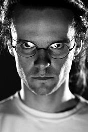
Paris-based Jean-Baptiste Guiton (pictured below) spent ten years in Chicago before moving back to his native France. His company, Studio 29, will be celebrating its tenth anniversary in January.
I loved this. And honestly, I do not know why more shooters are not doing videos like this to augment their marketing to future clients.
What, is there not enough room in the budget for YouTube?
Just as much as the technical stuff, I enjoyed watching the whole crew on this. John-Baptiste (seen at left) and the others clearly enjoy what they do. And that counts for a lot.
If ur not having fun, ur doin it wrong.
You can see more of Jean-Baptiste's work at www.guiton.net, including more makeup still life work for T. LeClerc. And speaking of T. LeClerc, they are running a big version of this shot here.
(Thanks for posting this, J-B!)
Chủ Nhật, 30 tháng 11, 2008
London Calling
If you are a UK'er and see an idiot walking around in shorts this week, please stop me and say hello. Or for a less random approach, I'll be at The Flash Centre in London on Monday the 8th. Please stop by!
If you are attending one of the London lighting seminars this weekend, please check in here for the latest info as the date approaches.
-30-
If you are attending one of the London lighting seminars this weekend, please check in here for the latest info as the date approaches.
-30-
Thứ Sáu, 28 tháng 11, 2008
Nikon D3X Leak Puppy Catches Own Tail
UPDATE: Nikon Rumors has published the entire article, with jpegs big enough to read the text.
__________
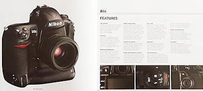
Long plagued with continual leaks, today Nikon decided to scoop all of the leakers by (accidentally) leaking their own announcement themselves. That is to say, a Euro version of Nikon Pro magazine (seen above) apparently went out early, en masse, before they could launch the "official announcement."
This being a lighting blog, our preference is to send you elsewhere for the whole D3X coverage orgy thing. I mean, sure, I want one and all. But sheesh, I am still digesting my turkey today.
(Thanks to Tom for the heads-up.)
-30-
Thứ Tư, 26 tháng 11, 2008
T-Day Speedlinks
If you are a turkey, today is a good day get out of town. Horrible, unspeakable things are happening to your kind on Thanksgiving Day here in the US.
But otherwise, have a happy and safe Thanksgiving. And after you are done feeding your face, don't forget about the big plate of speedlinks for dessert, after the jump...
__________
• Pixsylated has been on a tear lately, with this high-speed sync tute, and an in-depth field test of the RadioPopper RP-1's.
• If you have a teenage daughter, you probably know about Twilight, the juggernaut book series and new teen flick. Wanna guess who shot the movie posters? (We interviewed him a ways back, here.)
• How much work does it take to be a success in microstock? Way more than you probably think.
• As a result of user feedback, MPEX's Strobist Kits have been updated. Out: Batteries and chargers (which you can get just about anywhere.) In: White shoot-thru's and kit cases.
• Guinness Book of World Records, white courtesy phone please: Peter Emmett tests out the entire Rosco sample pack. Words fail me.
• From Malaysia, a new modular speedlight modifier kit.
• Not lighting, but the best reminder in a long time to always buckle up: A Nikon D3 sequence of a speedboat drag racing 200 MPH crash sequence, courtesy Mark Rebilas. (Scroll down for the good stuff.)
Chủ Nhật, 23 tháng 11, 2008
Colin Firth: CYA PDQ
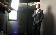
UK Photographer Greg Funnell shot actor Colin Firth for Time Out London, and knew he would only get a few minutes. Thus the "PDQ."
He wanted a lighting scheme that was safe over a range of subject orientation. Thus, the "CYA."
Hit the jump for a video, links and an alternate way to think about the light that can allow you to have your CYA-PDQ cake and eat it, too.
Greg was working in a hotel basement (ahh, the glamorous life of a photographer) and lighting with a pair of Elinchrom D-Light 2s in soft boxes. His solution was to run the boxes at 45-degree angles from each side of the subject. The idea was to get light that wraps and worked for either direction Firth might have been looking.
At this point, I should note that I am typing very quietly because the mere mention of Colin Firth in my household sends my wife into a dizzying tailspin of knee-buckling ecstasy. Something about a "pond scene" from Pride and Prejudice.
Me, I just don't see it. But my strategy during a Colin Firth Movie is always to focus on preserving that momentum, while being very careful not to do or say anything that might actually invite comparison between me and Mr. Wonderful.
I digress.
There is certainly nothing wrong with lighting Mr. Firth on the 45's. But if you are working with two soft boxes you can keep your safety while adding some directionality to the light.
The key is to recognize that the part of the photo that makes it sing is also your danger zone if you are trying to play it safe. That part would be the shadow area, obviously. So the idea is to balance the shadows so that they are there, but also legible if something interesting happens inside them.
You Knew This was Coming...
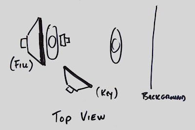
This is where off-axis key vs. on-axis fill can let you have it both ways. Let's work this one using Greg's exact gear used for the shoot: Two medium soft boxes and monobloc flashes.
Start out with one of your two soft boxes in the vertical orientation. Place it 45 degrees, give or take, to one side, and elevate it a little for good shape and form on the face. This, of course would happen before Mr. Why-Can't-You-Be-More -Like-Him arrives. You would test on the assistant or anyone else who happened to be standing around.
Remember to use whatever means necessary to get your stand-in to the right height, too. This is something you already know because you (a) Googled it, (b) asked an assistant, etc. Also find out of your subject will be wearing glasses, as that dictates lighting style to some degree.
Your fill light will come from directly behind the photographer's head, with the box in the horizontal orientation. This light is not so much going to shape the face as to fill and wrap the light. I would elevate it just a little, because your shoulders are gonna knock some of the bottom out, anyway. Maybe place the bottom horizontal edge of the box even with your shoulders.
Given that the D-Lite 2's have a built-in slave eye in the rear, I would radio (or PC cord) sync the fill unit behind me and slave the key light.
For ratios, start out testing the light with only the fill light firing. Adjust the light and/or aperture until your test subject has a good exposure. Now, back off the fill light (either by cranking the aperture down or dialing down the power of the light) until your subject is underexposed but still holds legible detail. This is the darkest your shadows will get in the final photo. And there will be no shadows you cannot see into, because your fill is coming from on axis.
Now, the balance is between safety and tonal depth. There is no set rule, other than how much of a weenie you happen to be on any given day.
Ten years ago, I would have set the ratio pretty tight. Stop-and-a-half, maybe. Because at that point I was all about the fear of failure. But now, I'd let it drop past two stops -- heading toward three, actually. Chuck Norris might take it down even further.
After you have completed this little exercise in self-examination, bring in your key light and dial it up so the subject looks great at your working aperture. For the shutter speed, you'll want to keep that up at max sync speed to nuke the ambient. Maybe warm up that key a tad with a 1/8 CTO.
Oh, wait, he is British -- better make it a 1/4 CTO.
As for direction of the key, you might want to work your angle so the subject's shadow falls far enough away on the background so you get some light on the background in the area directly behind the shadow side of your subject. You can vary this by either changing the key light location or moving the background further away from the subject.
There are side effects to consider. Changing the key location will alter the quality of light on the subject. Moving the background will alter the tonality of the background. Use the choice that works best for you. A combination of the two moves might work even better.
So now, when Mr. OhmyGodHeIsRightHereInFrontOfMe shows up, you know exactly how your ratios are going to look, no meter needed, and you are ready to roll from Frame One. Plus, you'll get shape and details no matter which way he looks.
And if you need an assistant, Missus Strobist is available -- at absolutely no charge whatsoever.
(Thanks to Greg for making and posting the video of the shoot!)
RELATED:
:: Greg Funnell: Website ::
:: Greg Funnell Blog Post (Includes Time Out Tearsheet) ::
:: Video: That Pride and Prejudice Pond Scene ::
Thứ Bảy, 22 tháng 11, 2008
Nikon CLS Video: We'd Tell You, But We'd Have to Kill You
Good news and bad news on the new Nikon CLS video.
Good news is that they are now in stock. The bad news is that Nikon Mall is only listing it on the US site, and they are not shipping it out of the country.
What, are they worried that the Taliban will get ahold of this stuff or something? Seriously, Nikon, this is nuts. Tear down that wall.
You have a worldwide distribution network, for Pete's sake. You could even move the video online and sell it that way.
Why make non-US Nikon shooters have to pay an arm and a leg for shipping? Or worse yet, smuggle it out while traveling to the US and pray they don't get chosen by our lovely TSA for a cavity search?
Honestly, I am at a loss. It is on Amazon now, at least, and MPEX has it, among others. Probably just a matter of seeing who can get it to you for just an arm, rather than an arm-and-a-leg.
C'mon, Nikon. You just ran the ball 99 yards. Don't fumble it in the red zone. If I were Canon, I would do a small-flash video like this and put it up online for free, right here.
-30-
Thứ Năm, 20 tháng 11, 2008
Orbis: First Look / Ray Flash Comparison
Just received one of the first Orbis ring flash adapters to make into this part of the world. Since I will not have time to shoot with it for a couple of weeks I am putting up a quick unboxing vid (and Ray Flash comparison) video for those of you thinking about taking the plunge.
(If you are watching this via RSS or Email feed, you may have to click through on the title of this post to watch the vids.)
My schedule is such that I will not get to really work with it until after Thanksgiving, which has me feeling like the kid in A Christmas Story pining after the Red Rider BB gun. Argh.
Oh well. After the jump, an additional (Orbis-produced) video.
From the "Episode 001" title on the Orbis video, it looks as if they are going to be uploading more stuff (tutorials?) in the future, too. Glad to see it.
Thanks for the Nomination!
Muchas gracias to whoever nominated Strobist for a 2008 Weblog award in the Photo category. (Apparently, they didn't have a DIY black-straw snoot category.)
The gesture is much appreciated. If you want to second (or third) the nomination, you can do so by clicking the little green "+" button on this comment right here.
This is a call for nominations. If we make it to the finals, voting for that will begin on December 8th. And to everyone who added their vote to the nomination, a big thank you.
-30-
Thứ Ba, 18 tháng 11, 2008
Cheap Bouncy Fun
A couple of weeks ago, when we ran the post on the DIY bounce reflector thingie, I got several "Do Not Publish" comments that basically said:
"Are you brain dead? Do you realize you are pointing people to instructions to DIY a product made by one of your advertisers?"
To that, I say:
"Geez, ma, why do you always leave DNP comments on my blog? Can't you just phone me like all of the other bloggers' moms do?"
Kidding -- I love Mother Strobist to bits, which is why I always take advantage of any excuse to run her photo on the blog. (Click it for a corner headshot tute.) And I certainly hope you did not get the wrong idea from that headline.
But while I'll grant you that the brain-dead thing may be debatable, there are actually some gear manufacturers who genuinely want to teach people to light -- whether they buy the gear or not.
Don't believe me? Check out this video from Lighting Academy, after the jump.
__________
I know lots of questions are popping into your mind right now. Questions like:
• Why would a lighting gear manufacturer publish DIY tips using Home Depot stuff?
• Forget the lighting tips, where can I get that fly outfit?
• And, how come German mannequins got nipples and ours don't?
Actually, turns out that the low-budget themed Lighting Academy is run by the very same folks who were being DIY-hacked by the blogger in the post mentioned above. It is the pet project of Peter Geller, the head honcho at California Sunbounce.
And while CSB's pro gear may not be for the faint of wallet, what he really wants is to teach the world how to shape light. Lighting Academy may have an ad for CSB on it, but it is also chock full of videos (with English versions coming on line soon) to show you just how simple it is to shape light with cheap, DIY gear.
I do not have to tell you how cool I think that is, and how happy I am to be associated with CSB as a result of that compass point. They have produced a ton of videos (link below) on how to light using the CSB line. But even if you can't afford the good stuff right now, you at least can afford the good light.
My only question: Why doesn't every company do this? Seriously, if you are a lighting gear company, how can you not be doing this?
It costs very little. And CSB is not giving away the store, either. Quite the contrary, they are minting photographers who want to better shape their light -- even if they currently are dirt broke.
And if there is any justice in the world, some of that good karma will come back later when the DIY-type photographers want to pony up for the good stuff later.
You can watch more cheap, bouncy fun at Lighting Academy. And you can see CSB's ever-expanding library of lighting videos here.
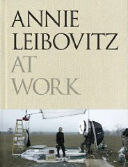
First Look: Annie Leibovitz At Work
UPDATE: Annie Leibovitz passed through Seattle on her book tour, much to the delight of a few Strobist readers...
__________
First previewed here last August, Annie Leibovitz: At Work is finally wrapped in those little brown Amazon fold-boxes and hitting doorsteps everywhere.
I have just spent the afternoon with my copy, which I pre-ordered when it first became available. It is a departure from the previous picture books she has published, the main difference being much more back story to go along with the photos.
What to Expect
Originally, I expected to get a more nuts-and-bolts, gear-and-technique type book. But instead the she spends the time on her experiences surrounding approximately two dozen different sittings and projects.
Instead you are taken along with her on her shoots, almost as if she is sitting down after each one and talking with you about it over a cup of coffee. Much space is given to her approach, what she is thinking, problems to be solved, photographer-subject interaction and the like.
From the comments I get in the On Assignment posts, it is clear that many people put a premium on this type of information. From my perspective I have sometimes found that hard to understand. (Just shut up and tell us how to light it, Flash Boy...)
But having read through Leibovitz's book, I find her openness and honesty about the process to be far more valuable to me than the lighting stuff. The cover may show her inside of a typically Leibovitz lighting setup, but the book is not about lighting. It is more to get you inside her head.
If you are a fan of her work, you will find it very enjoyable -- and come away with a much better understanding of her motivations and how she works. If you are sick of her, this book will only make you more so.
Count me among the former.
The book comprises her entire career to date. She revisits the early days at Rolling Stone, the American Express ad campaign, Vanity Fair, etc. She spends time on those multi-panel "big pictures" that did for VF, too.
For those of you who are not near a Borders or some other big book store, I did a quick thumb through of the book simply to give an idea of the photos-to-text ratio. While not a picture book per se, it is very much a book about photography. And by that, I mean a look at everything that goes into Leibovitz's photography.
You'll remember the YouTube video (since pulled) of her session with The Queen. Having seen footage from that shoot, it is very interesting to hear her talk about it, too. She devotes ten pages to that shoot, and includes each of the photos approved released from it.
I was surprised to find that not one, but two of the Queen photos are composites. Also, I found it oddly gratifying to read how the whole thing seemed to be coming apart at the seams in Leibovitz's mind. Of course, she was still able to make four gorgeous historical portraits despite her internal panic.
That tells me much more than the shoots with her Hollywood pals who will do damn near anything for her. I expect that this is a book I will read a few times at different levels, trying to glean what information I can that will help me with my own portraiture.
She does spend a chapter on gear: Cameras, lighting, fans, music, etc. But that is not the focus if the book.
Which is fine. The lighting stuff is physics. A trained monkey can do that, my friend Jed Kirschbaum is fond of saying. (I would note that Jed shoots mostly available light, tho.)
What I am interested is learning more about the difference between the way I think and the way someone like Annie Leibovitz thinks. And for that, At Work foots the bill.
If you have gotten a copy already, sound off in the comments. More voices, the better. Didja like it? Didja not? Why? Why not?
_________
Annie Leibovitz: At Work is available at Amazon.com and, soon, at bookstores everywhere.
Chủ Nhật, 16 tháng 11, 2008
On Assignment: WiMAX
I am a geek.
For the first 30 years of my life, that was seen as a liability. But lately, it has been a lot more fun.
And as a geek, when I got a recent assignment from USA Today to shoot the first-ever rollout of WiMAX on a city-wide scale, I was stoked.
If you are not familiar with WiMAX, think Wi-Fi, stretching for several miles from each access point. Think 5 megabits downstream and 2 upstream in a car traveling 70 MPH on the interstate in the middle of nowhere -- WiMAX rocks. But as sexy as the tech is, my assignment was to shoot a photo of guys testing out the system.
(I don't care. I am still interested.)
And on top of the potentially boring picture part, the worry was that they might be showing up just for our benefit. That is always a concern on this kind of a newspaper shoot.
"Use your judgement," the editor said. Which is fine up to the point to where you try to figure out what you will turn in if it turns out that the whole scene is a setup.
Needless to say I wanted to light, but I did not want the gear to create a big fuss and influence the scene. So I went with a single SB-800 on a stand. Speedlights give me the ability to light quickly, portably, and without the excess gear that can influence a situation.
Flash on a Stick
The assignment was to shoot technicians testing the WiMAX gear in Ellicott City, MD, then head up to Baltimore's Inner Harbor for a rooftop installation which would afford us a full view of the city the WiMAX was designed to cover. So I knew where my lead photo would be -- on that high-rise rooftop. My plan was to shoot the techs first for the jump page (assuming they were really working) and then move on to the second site for a cool, lit-portrait lead.
"Plan A" bit the dust as soon as I arrived at the installation testing site. Turns out the next site had the antennae enclosed in a shed on top of the building. No view for me. Now the technician/testers were gonna be lead. The good news was that they were actually working, and not just for my benefit. (That was a relief.) So I stuck the SB-800 on a stand while I wondered what the heck I was gonna do for a jump page photo.
Bare speedlight on a stand is usually the first thing I do when I get to an assignment. I am almost certainly gonna use at least one, and it allows me to appear to be doing something while in fact I am wondering what the heck I am going to shoot.
True to form, the tech was working in the strong shadow created by the morning sun. Ten years ago, this would have pissed me off as I resigned to use on-camera fill flash. But today I see this as a blessing -- it gives me nice diffuse light a few stops off of my main ambient exposure in which to build some directional light.
Looking at the photo up top, with sun coming in from back camera right, the obvious key light position is gonna be from front camera left. This crosslights the tech who is wearing a branded XOHM shirt -- as I am sure he does every day even when newspaper photogs are not there shooting him. (Hey, at least he is doing real work. I'm not complaining...)
But that key light is gonna leave me with dark, harsh shadows both on my technician and in the area where he is working. So I stuck another SB on my camera to reach up in there and provide some fill. Now we have a no-fuss, three light setup: Sun back/right; key front/left and fill from on-axis.
In a situation like this, shooting in manual is probably gonna make more sense than TTL. Reason is, that highlight on the panel at left is gonna change as you change your shooting angle. And it could very well influence your TTL response. I used both TTL and manual in this shoot, but ended up in manual just for that reason.
For a trigger, I fired my fill light on-camera and slaved the SB-800. Dear Lord, I love those perfect little flashes.
Last week, we talked about how to do this in TTL mode. It is very easy in manual, too. Crank the ISO down low. Shutter at 250th of a sec. Choose an aperture that gives you a nice, rich exposure. Bring your key light in against the ambient on manual power until it lights your subject well.
Generally, in a situation and working distance like this a 1/4-power manual shot is gonna get you very close. If it is not dead-on, it is in the ballpark for an easy, quick adjustment.
The key-to-subject distance is fixed, so nothing changes as long as your ambient is constant. If the sun goes behind the clouds, open up your shutter to adjust your ambient and then keep shooting. It's so easy, even a photographer could do it.
The one variable you'll need to keep an eye on is the on-axis fill if you are working in manual flash. I dial in the power level until the fill looks good in the screen on the camera back. Then I adjust it, based on whether or not I move in or out from the subject. Remember, this flash exposure is going to change as your camera-to-subject distance changes.
But you can use your movement as a quick flash adjustment, too. If I need a tad more fill light in manual I may just move in a foot or two and zoom out to compensate. Presto, your manual fill flash is brighter. You get the idea.
I knew a wrestling shooter who used to fine tune his focus that way before the days of autofocus. He would just sway to and fro as he shot, looking like he was lost in some sort of religious chant. Worked, too. Or maybe he was praying for sharp photos. I certainly have done that on occasion.
Back to the light, the on-axis fill defines the contrast range of the photo. Ambient sets the environment, key light properly exposes the subject and on-axis fill dials in the shadow contrast. He wasn't doing anything sexy (unless pumping stream after stream of throbbing test data through a network turns you on) but I was able to get quite a few different looks very quickly with this lighting setup.
On to Plan B
So, now that the skyline is a bust and the jump photo has just bubbled up to the lead, I need a new jump photo. A few questions later, we find out that other engineers are testing WiMAX bandwidth with mobile laptops nearby.
That is not the kind of photo that would normally excite me. But compared to not having a jump photo, it is absolutely fantastic. A half hour later we caught up with them, sitting in their car in crappy overhead light.
Once again, what I used to consider as a liability is now an opportunity. My guy is sitting in a car in backish/overhead light, working on a laptop in a car. (Yeah, I know -- they can't all be firefighters tossing babies out of burning buildings.) But, like I said, compared to having no jump photo I'll certainly take it.
Again, bare flash on a stand makes easy work of a guy in a car. I just walk it around to the front of the car and aim it through the front windshield by sighting the angle from the flash. I aimed it to hit his face from a profile-to-slightly-backlight position. I set the flash on 1/4 power (I hang out there a lot) and walked around to check the intensity and direction of the light.
Direction was good, but the light level was a little off. A quick adjustment of the flash's power level and I was in business. Trigger on this setup was a Pocketwizard. (Since I was not using on-axis fill, I had no light to trigger the key via optical slave.)
Are these sexy, glamorous photos? No. They are simple, block-and-tackle, hit-for-average shots that define what you settle for on the low end of the quality scale.
I have said it before, and I will say it again: I consider these photos just as important to light effectively as is the bigger stuff. All the more so, really, when you consider that what you do with these types of jobs define the "floor" on range of what you produce.
CYA With a Detail
One last thing. Like Bob Hamilton, my DOP at The Sun, used to tell me: Always look for a detail photo.
If you get into a practice of grabbing at least one relevant detail on every assignment, you frequently will save a page designer's butt. And occasionally you'll save your own. And if your light-on-a-stick is already set up, adding dimension to the detail shot is a very easy thing to do.
For this close-up shot of the XOHM WiMAX card, I already had back/overhead key from the sun. So sticking my flash down close to the ground in front and uplighting the card was the best way to cross light it to give it a little more pop. Nothing earth-shattering, but it gives a secondary highlight and makes it look better than a one-light-source shot.
Did I mention how much I love those 5-section, compact light stands? This is one reason why: You can crank them down to the height of a tiny background stand for a quick uplight when you need it.
Again, nothing sexy. But being in the habit of lighting the details (and shooting them, for that matter) is a good work ethic and will pay you dividends down the road.
_________
NEXT: On Assignment: Manil Suri
Jerry Vo Takes October -- With a Pair of 'Ebay Remotes'
Congrats to Jerry Vo, whose days of annoying strobe misfires are history. Vo shot his way to a free pair of Pocketwizards for the month of October in the Going Wireless contest by using a pair of what have ironically become known as "poverty wizards."
He'll be able to shoot his next model from 1600 feet away.
If you want a shot at the last set of PW's to be given away, you'd better hustle up. The last day to enter a video (or re-tag an existing video) is November 30th. Chop chop.
More on Vo, including links to more of his work, at the Pocketwizard Blog.
-30-
Thứ Năm, 13 tháng 11, 2008
Orbis Enters the Ring
The much-awaited Orbis Ring Flash Adapter is finally coming off the production lines. Enlight Photo has moved from a teaser site to the Full Monty, with lots more details and pix.
Orbis is the first (non-DIY) competitor to the Ray Flash, and lowers the entry cost for a commercial ring flash adapter.
Highlights:
More details, FAQ, pix, etc., at Orbis website.
-30-
Orbis is the first (non-DIY) competitor to the Ray Flash, and lowers the entry cost for a commercial ring flash adapter.
Highlights:
• Introductory Price: $169 US (with $16.99 shipping to US - for other areas see site)
• One size fits most all shoe-mount flashes -- except the big-headed Vivitar 285, apparently.
• Requires off-camera sync of some kind (can use off-camera TTL cord)
• Larger lighting surface area than Ray Flash - (should be softer light, will test soon)
• First units ship in December, in three weeks
More details, FAQ, pix, etc., at Orbis website.
-30-
Thứ Tư, 12 tháng 11, 2008
There Goes the Neighborhood
I first got to know Drew Gardner by reputation before I ever met him. I was standing in The Flash Centre's London store and I saw these amazing, humongous photos on the wall. They were beautifully lit, but they also had a unique personal style and were full of humor. Anyone who makes shots like this has got to be fun to hang around with, I remember thinking.
The first time I met Drew in person, we had both just arrived at a hotel in Dubai in the middle of the night. I knew he would be there and recognized him from the accent and the clean-shaven head from the back.
We were both dog-tired from the flight. He did not know who I was. We had not yet even met. Perfect time to have a little fun...
So, here's drag-assed Drew, looking like a boneless chicken trying to get registered at the hotel. The only thing he is still carrying is his California Sunbounce kit, which only weighs a few pounds. But we can fix that.
As he talks with the desk clerk, I very lightly place a hand on the CSB kit hanging on his shoulder. If you are going to do this kind of thing, always start with a very light touch. Then add just the tiniest amount of weight to your hand. A little more. A little more.
The object is to make that thing go from a couple of pounds to twenty or thirty pounds without the guy noticing the change. One's goal is to boil the frong, as they say.
About 30 seconds into it, he finally gives up on resisting the pressure. He collapses his shoulder, turns around saying "What the...?" and sees a smartass photographer whom he had never met smiling at him with a hand still on his CSB.
I am happy to report that Drew didn't punch me in the face. Which, of course, means that he truly is a guy who you'd want to hang out and have beers with. And we have tested that beers thing on several occasions since.
But Drew is more than just a good guy, he is a helluva photographer. He is an A-lister out of the UK, and I am very pleased to welcome him to the world of photographers who are blogging with the goal of teaching others.
The guys makes some amazing photos, and has a wonderful sense of humor and whimsy that shows in his work.
He likes to play with the big toys, as shown in this video of him testing out the brand new Phase P65+ medium format digital back:
Drew's world is one of big lights and big ideas. I mean, when is the last time you rented a water buffalo for a shoot?
He has been blogging for a little while now at "The Dark Art," his quirky little corner of the photo world.
I very much hope you'll put him on your rounds / RSS feeds / whatever, as I can tell you from experience that you'll learn a lot hanging out with him.
Right out of the blocks, he has pieces on subtractive fill for white-on-white, the anatomy of a composite shot and a test drive of the new P65+ back.
He even takes you back to a time long ago, when he had youthful idealism and hair, to tell you how it all began.
The world of photographers educating other photographers just got a little bit better. I hope you'll join me in welcoming him to the neighborhood. And if you want to see more of Drew's work, his main photography website is here.
Thứ Ba, 11 tháng 11, 2008
Light Fare in Bilbao
If you happen to get hungry for tapas in Bilbao, Spain this month, be sure to stop by Café Iruña. The restaurant, which has been in continuous operation for over 100 years, is featuring an exhibition of photographs by Strobist readers.
There's even a meetup scheduled. Thanks much to Rafa at SeE for the assist.
If you are looking for an outlet for your local band of lighting enthusiasts, consider offering to do a group show at a coffee shop of local café, etc. They are always looking for local art that has a little edge to it. And it will help you hook up with more people in your community, be they fellow photographers or future clients.
___________
MORE INFO:
Map/Info
Newspaper story on exhibition (in Spanish)
More photos (slideshow)
(Photo: El Correo Digital)
-30-
Chủ Nhật, 9 tháng 11, 2008
On-Axis Fill: Run-and-Gun Version
These days when I shoot something my workflow is such that I make time to light it. My assignment pace is a little more sane than the two- to three-a-day pace of my days as a newspaper shooter.
Actually, I have had had five- or even six-assignment days on occasion. But thanks to my therapist, I have learned to repress most of those memories. (Calm blue ocean, calm blue ocean...)
Days like that are a recipe to just say "screw it" and shoot everything available light. Or on-camera bounce flash. But it doesn't have to be that way. And on-camera fill against off-camera flash is one technique that would have been a tremendous help to me as a newspaper shooter on those days from hell.
Keep reading for one way to light when you don't have time to light.
Hey, What's This Flash Bracket Thing on Top of My Camera?
Okay, let's be clear here. I am talking about direct, on-camera flash. And before you jump all over me, think about what on-camera fill flash is designed to do: Tame the shadows.
The problems -- the sameness -- that results from typical "3-D, matrixed-balanced, whizz-bang TTL fill flash" when it is used on-camera for ambient fill is that you are still at the mercy of your available light. The flash is merely there to fix the eye sockets. Or whatever else is going too dark.
But we can take that straight fill concept one step further, and add it to light that we have designed. In this environment, bare, on-camera flash can do some cool things for us.
When I say "on-camera," I am talking about either a shoe flash or a pop-up -- either can do the job. But the key difference is that we can use this flash as a third light source if we have a second flash.
For people who own a pop-up flash camera and a shoe-mount flash, this is a great run-and-gun setup. The on-camera flash gets used the same way a ring light would be used -- while crappy as a main, it is pretty cool as fill.
When I say "third light source," I am including the ambient as one of the first two sources. Which means if you have two shoe-mount flashes (or a single shoe-mount and a pop-up flash) you have a three light setup at your disposal. You just need to design the light so all three sources are working for you in concert.
Let's back up. If you are pushing on-camera fill into directional ambient light, you are doing one of two things: You are either filling angular front light or filling a backlit situation.
With the former, you still have no edge lighting to give you three-dimensional form. With the latter, you are basically key-lighting with direct, on-camera flash. Neither is going to be very interesting, and you will have very little control over your exposure choices, either -- it is either right or wrong.
But when you introduce a second flash (which means a third light source) you get the ability to cross-light and fill at the same time.
Take Me to the River
Let's do a walk-through of the above photo as an example. I was shooting a graduate school project to assess the health of a local stream. The light was what I would formerly consider horrible: Mid-day, high, back-ish overhead sun in a mottled, wooded environment.
If I fill that using only on-camera flash it is gonna look like crap. Well, maybe not crap but certainly not very interesting. No, check that. It'll look like crap.
And if I turn around, stick the sun behind me and fill it on-camera, it looks like every other fill flash photo in the back of every camera brochure in the world.
My goal in this setting is to use the sun as my backlight. Why? Because the exact lighting angle does not matter nearly as much as it would if I used it as a key, and it does not get in peoples' eyes. So no squinting.
Given that I am gonna backlight with sun and key light with off-camera flash, I can choose to set the entire scene at any tone I want. Start at a 250th of a second shutter speed to get a friendly aperture. Then dial that aperture around until I see a nice look for the environment. For me this usually means underexposing the ambient by a stop or so.
Essentially, I am exposing for the highlights, as if I were shooting chrome in the old days. (Back when we had to walk to our assignments, barefoot, in the snow, uphill, both ways.) Except that this time, we are not gonna let the shadows fall off the table into the deep, black abyss.
My back light and full scene established with the manual ambient exposure, I can now think about the key light. Since I am walking around on slippery rocks with a few thou in camera gear dangling from my neck, I am gonna go handheld and light them from the left side. Nothing fancy, and no stands. Camera in right hand, flash in left hand.
I normally shoot manual flash, but I am perfectly willing to use whatever mode works best for me in a given situation. So in this case, I stick the flash on TTL. (WTF? On-camera and TTL?)
Yep. For the flash, anyway.
I am in manual mode on the overall exposure, which means a straight TTL flash will be neutral. If I were underexposing the ambient by one stop in shutter priority (to keep a constant 1/250th of a sec shutter speed) I would juice the TTL flash by one stop to compensate for the overall "-1 stop" exposure compensation. That's just the way the camera settings work.
Now, if I TTL my flash (using, say, an off-camera TTL cord) then any frontal area that is not lit by the flash (or the sun) is gonna be very dark. That includes up under chins and the camera right sides of Charlotte and Chris, my stream diggers du jour.
And the more I saturate that environment the more the flash shadows are gonna drop. This will make the scene look very "flashed" and the overall lighting will look very harsh. But the object here is more legibility, a more natural look and total control of the various tones in the whole photo.
That's where the on-camera fill comes in. By dialing that in fill to, say, minus 2 1/3 stops, I can keep my lighting controlled and see up into my shadows. This gives me total control over three light zones of the photo: Environment/backlight, key-lit areas and fill areas.
Take a look at the lit areas up close in this sectional detail of the photo above. Examples of the fill areas would be the shadow side of Charlotte's face and under Chris's chin. Key light areas would be anything that is lit from camera left.
Environment is controlled by overall exposure. Key is controlled by the relative (+-) TTL setting on the key flash. Fill is controlled by the relative TTL setting on the on-camera flash.
If you look at Chris's neck, you can see both a fill area and a small, very dark, no-flash area that shows you how deep all of the key shadows would be without the on-camera fill. You can also see the no-flash area Charlotte's chin. Imagine all of the key shadows being that dark. That's the difference between on-camera fill and not, when key lighting off camera.
Camera/Flash Settings
Yes, you could do this with manual flash very easily if you are not moving around too much. But this is a good example of when to offload that extra thinking and minute control in exchange for mobility. When you are looking for good footing, you can just find a safe spot, compose and zoom to compose. The camera and flash will get it pretty close. If it misses, adjust the key or fill TTL level to taste.
Two light modifiers are being used here: I have a dome on each flash. This does not affect the light quality (no walls or ceiling to bounce off of) but makes both lights pretty omnidirectional. It helps the on-camera flash put out a signal that the off-camera flash can easily see. At this working distance, I got a 1.000 batting average that way -- no misfires at all.
It does force your flash to put out more of it's power to compensate for the light being eaten by the dome. That will shorten the range in which you can work and/or increase recycle time. But it is offset by the fact that this flash is firing at two and a third stops under TTL, which pretty much negates dome-induced problems.
The key light has a dome and a 1/8 CTO get to warm things up a bit. This is a standard gel for my key light. And the dome means I do not have to concentrate on having good aim with my hand-held key. It lights in all directions.
Pop-up flashes work great as fill for this look, as you can see here, but you'll need to work pretty close to your subject. Also, you'll wanna lose the lens shade as it will throw a shadow from the pop-up (which is so close to the lens axis.) But honestly, if you can get away with a pop-up, the fact that the axis is closer makes it work better for this kind of on-axis fill.
In Nikon-CLS speak, my on-camera flash is the master flash and the handheld flash is the remote. They are both set to fire at TTL setting, with the on-camera fill dialed down 2 1/3 stops. Hopefully, people with other camera brands will interpolate these settings in the comments and post a translation. I no speak de Canon.
Recommended by Lazy Photographers Everywhere
If all of this sounds like a lot of work, it's not. Start at a 250th to get a friendly aperture, dial in the aperture that gives you the best saturated-looking scene. Set your key light at TTL and your on-camera flash at -2 to -3 stops under TTL for this look.
These setting are not set in stone, either. Play around. You can go for a natural look or really amp it. Keep your key light close to straight TTL for some level of "visual anchor" if you want to get weird with it. Drop the ambient a little more. Amp the fill a little more. Better to work against the ambient, too. That is to say, shoot into the light.
You'll get a wide variety of looks, and each will be suitable for different situations. But the important thing is the light-against-light control. And even more so, the ability to light three dimensionally on the run without stands, time or worry.
_________
NOTE:
If you are already using this quickie two-flash technique please hit us in the comments on how you are doing it, and what you are shooting with it.
Thứ Năm, 6 tháng 11, 2008
New Nikon Video: 154 Minutes of CLS Goodness
[UPDATE: There has been a lot of teeth gnashing about this DVD not being available outside the US. But I just found a source in Dubai (UAE), where you can get just about anything on the planet. Pretty sure they ship anywhere, too...]
__________
EDITOR'S NOTE: With all apologies to the Canon shooters who frequent this site: You really shouldn't even read this post. Seriously. Move it along. Nothing to see here...
__________
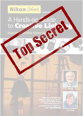
I have just finished watching an advance copy of Nikon's new DVD, Nikon School: A Hands-On Guide to Creative Lighting.
Short version: It is far and away the best resource available for those of you who want to better learn how to use your Nikon system strobes (SB-900, SB-800, SB-600, etc.) and Nikon's Creative Lighting System (CLS).
I am told they will be hitting the shelves shortly. Nikon Mall is up, but showing out of stock right now. I will post another note when they pop up everywhere. But I wanted to give the CLS-shooting readers an early heads-up that this is exactly the video they have been waiting for.
More info, and a brief trailer, after the jump.
(Uploaded with permission from Nikon.)
The 2 1/2-hour DVD starts off with photographer Bob Krist taking you step-by-step through both basic lighting principles and showing you how to work the CLS settings on the various Nikon flash system components.
Even CLS beginners will feel right at home starting with this portion of the DVD. He shows you how to set up the various flashes and gets you comfortable with the way the system works.
Bob then walks you through a couple of straightforward shoots in the studio to show you how easy it is to get rolling. He does a progressively lit portrait session and a quick, two-flash macro close-up of a pocket watch. This is basic stuff that will be remedial to some of you CLS studs. But is important to include the basics so as not to leave anyone behind.
As expected, it is pretty much a continuous Nikongasm. The gear is explained thoroughly, and they are here to show you how to use the specific components. But they go above and beyond the corporate video/commercial genre, especially when they get to the second part of the video.
A Grande-Sized Cuppa Joe
In Part Two, Bob assumes the role of color man to Joe McNally's lead as they work together to produce a series of increasingly complex location shoots. They progress from simple, one-light potraits to a classic, McNally-esque speedlight orgy.
They shoot dancers at a ballet school, a home bridal portrait series and a sequence of photos at a harbor. Each of these locations include a series of different setups -- they work a lot of different looks from each scene, too. Joe is thinking out loud, explaining what he is doing and keeping a steady stream ofBS rapport going with his subjects.
Bob becomes your stand-in, making sure nothing gets glossed over. They shoot, see the problems, work through them and get to the look that they want. Plenty of time is spent on the process, and no "magic black boxes" obscure the path from start to finish.
They do edit down the final shoot on the boat (13 speedlights, fer chrissakes) for what I can only assume to be time limitations on the single DVD. Or maybe that is where the fight scene happened. (Was that a butterfly Band-Aid on McNally's forehead afterwards?)
I cannot stress enough how pleased I am to see such attention to detail for the lighting processes in the video. It is not just a gear tease -- they are showing you exactly how to use the flashes to get beautiful results. This is everything the Speed of Light video (watch it here) left you wanting. That video felt more like an extended commercial. This one is a legitimate course in small-flash lighting.
If you are a Nikon CLS shooter (or hope to be) this DVD is an absolute no-brainer at $39.95. Grab it as soon as it becomes available. I'll post on that as soon as it starts popping up in stock, too.
Congrats to Bob, Joe and the powers that be at Nikon for looking past the obvious extended commercial to create something of value that will be helpful to so many people.
And Canon, if you are reading this I am calling you out right here and now. Make a DVD like this for the Canon flash system. No point in building in all those bells and whistles and not showing people how to use them. And this site will be happy to help spread the word if you do.
I happen to shoot Nikon, but I would love to see every photo manufacturer doing this kind of thing. Eventually, I would love to see manufacturers skipping the DVD process altogether and streaming this stuff online for free.
When they amortize the production costs over the extra gear that would sell, they would come out ahead. And so would their customers.
__________
EDITOR'S NOTE: With all apologies to the Canon shooters who frequent this site: You really shouldn't even read this post. Seriously. Move it along. Nothing to see here...
__________
I have just finished watching an advance copy of Nikon's new DVD, Nikon School: A Hands-On Guide to Creative Lighting.
Short version: It is far and away the best resource available for those of you who want to better learn how to use your Nikon system strobes (SB-900, SB-800, SB-600, etc.) and Nikon's Creative Lighting System (CLS).
I am told they will be hitting the shelves shortly. Nikon Mall is up, but showing out of stock right now. I will post another note when they pop up everywhere. But I wanted to give the CLS-shooting readers an early heads-up that this is exactly the video they have been waiting for.
More info, and a brief trailer, after the jump.
(Uploaded with permission from Nikon.)
The 2 1/2-hour DVD starts off with photographer Bob Krist taking you step-by-step through both basic lighting principles and showing you how to work the CLS settings on the various Nikon flash system components.
Even CLS beginners will feel right at home starting with this portion of the DVD. He shows you how to set up the various flashes and gets you comfortable with the way the system works.
Bob then walks you through a couple of straightforward shoots in the studio to show you how easy it is to get rolling. He does a progressively lit portrait session and a quick, two-flash macro close-up of a pocket watch. This is basic stuff that will be remedial to some of you CLS studs. But is important to include the basics so as not to leave anyone behind.
As expected, it is pretty much a continuous Nikongasm. The gear is explained thoroughly, and they are here to show you how to use the specific components. But they go above and beyond the corporate video/commercial genre, especially when they get to the second part of the video.
A Grande-Sized Cuppa Joe
In Part Two, Bob assumes the role of color man to Joe McNally's lead as they work together to produce a series of increasingly complex location shoots. They progress from simple, one-light potraits to a classic, McNally-esque speedlight orgy.
They shoot dancers at a ballet school, a home bridal portrait series and a sequence of photos at a harbor. Each of these locations include a series of different setups -- they work a lot of different looks from each scene, too. Joe is thinking out loud, explaining what he is doing and keeping a steady stream of
Bob becomes your stand-in, making sure nothing gets glossed over. They shoot, see the problems, work through them and get to the look that they want. Plenty of time is spent on the process, and no "magic black boxes" obscure the path from start to finish.
They do edit down the final shoot on the boat (13 speedlights, fer chrissakes) for what I can only assume to be time limitations on the single DVD. Or maybe that is where the fight scene happened. (Was that a butterfly Band-Aid on McNally's forehead afterwards?)
I cannot stress enough how pleased I am to see such attention to detail for the lighting processes in the video. It is not just a gear tease -- they are showing you exactly how to use the flashes to get beautiful results. This is everything the Speed of Light video (watch it here) left you wanting. That video felt more like an extended commercial. This one is a legitimate course in small-flash lighting.
If you are a Nikon CLS shooter (or hope to be) this DVD is an absolute no-brainer at $39.95. Grab it as soon as it becomes available. I'll post on that as soon as it starts popping up in stock, too.
Congrats to Bob, Joe and the powers that be at Nikon for looking past the obvious extended commercial to create something of value that will be helpful to so many people.
And Canon, if you are reading this I am calling you out right here and now. Make a DVD like this for the Canon flash system. No point in building in all those bells and whistles and not showing people how to use them. And this site will be happy to help spread the word if you do.
I happen to shoot Nikon, but I would love to see every photo manufacturer doing this kind of thing. Eventually, I would love to see manufacturers skipping the DVD process altogether and streaming this stuff online for free.
When they amortize the production costs over the extra gear that would sell, they would come out ahead. And so would their customers.
Thứ Tư, 5 tháng 11, 2008
Lighting 101 PDF Translation Project
UPDATE: Lots of new languages are in play on the discussion thread linked below. We'll let the discussion fizz a couple more days and then break it up into language-specific threads to get things started. Thanks, Y'all!
_________
Thanks to the multi-lingual talents of reader Andrew Dahms, I am happy to announce that Lighting 101 is now available in Japanese as a downloadable PDF. The document is being released with a Creative Commons license under which it can be printed out, shared and/or hosted anywhere. The only restrictions are that it cannot be altered or used commercially, and attribution must be included.
Keep reading for more -- including the Japanese download link, other PDFs in the pipeline and how to help translate Lighting 101 into your own language.
Hardly a week goes by that I don't get an email from someone offering to create a piggy-back site and translate Strobist into another language. Or a note that they already have been translating the site somewhere. (Which is not cool, actually...)
Having a slew of foreign language sites is good in theory, but in practice tends to create more administrative problems than it solves. As the content creator, I need to keep control over the site's original material. But even being loosely involved with administering a couple dozen translation sites is beyond my capabilities at this point.
And while the written material on Strobist is free -- and always will be -- it is only when people actually visit the site that the economic model of free content works. Not only do the advertisers pick up the tab, but some have actually altered their focus to better serve the site's readers. That's way cool. But I have to center the readership here for that to keep working.
The solution was to translate the core unit on the site into multiple languages within a locked document format. Hopefully, many people will benefit from the translated L101, and enough of them will trickle in to read more in English so that it will have been worth the traffic dilution.
Leading Off: Japanese
The first L101 translation to be released is Japanese. It is available via MediaFire, here. Japan has vibrant photographic community, and it is my hope that some Japanese-speaking photographers will benefit from being exposed to Lighting 101.
If you are part of the Japanese online community (we had 3,451 visits from Japan last month) I hope you will help to seed this Lighting 101 module into some of the Japanese language photo sites. You are free to link to the MediaFire hosting site where it is now, or to download and host/post/share it in any way you like. Just do not alter it or charge for it -- it is meant to be free.
And, thanks to the intrepid Rafa Barbera, who has been running the Strobist en Español site, Lighting 101 will soon be available in Spanish as a PDF. Constructing a mirror site is an ongoing commitment on both ends. So for now, translated PDFs will be the way to go.
Lighting 101 is also being translated into Mandarin Chinese, thanks to the efforts of reader David Li.
As there already are Italian, German and Danish Strobist groups on Flickr, my guess is they will happen as PDFs, too. More on that below.
Help Translate L101 into Your Language
If you are a long-time reader of the site and are native in some other language, you can help to spread the information in Lighting 101 to others. I am looking to crowdsource the process and will gratefully accept the efforts of anyone who wants to chip in.
Many hands make light work, so my preference is to use a team of translators for a given language. If we can get a few people willing to pitch in, I will be more than happy to greenlight a translation PDF and host it. French, Hungarian, Swedish, Klingon -- whatever. The more the merrier.
For each language, we will need:
• A project lead: This person will coordinate the group's translation efforts and help with translation.
• A designer: Someone who can create a PDF document similar to the Japanese example released today -- could also help with translation. A designer could also be a project lead, if they were willing to serve in both capacities.
• An editor: Someone who was not involved in the translation, to make sure the translation is faithful to the original.
• Additional translators: Several people working together in this capacity will make the project easily doable.
Ideally, translators would be native speakers of the target language, be fluent in English and be very familiar with the material (i.e., long-time readers). Once a team has come together to translate into a given language, I'll get it started, including some additional guidelines, Creative Commons image files, etc.
Bear in mind that this is a bit of an experiment, based on the ideas and generous volunteer efforts of those responsible for the languages already in translation. I think it is a wonderful idea, and an ideal way to pay forward any help that this site may have been in broadening your understanding of small-flash lighting.
I have set up a Lighting 101 Translation Thread on Flickr. If you are not already on Flickr, you will need to sign up for a (free) account to be involved. From there, groups can form into various languages, share documents via email (or Flickr mail) and coordinate with me.
I will vet each translation before releasing it on the site in its official form, so please to not turn them out in to the wild before they are complete. I will also monitor the translation thread and answer any questions that pop up. Please ask them there.
For those who choose to get involved in a translation project, my sincere and heartfelt thanks and the thanks of those who speak your language who will learn more about lighting as a result of your efforts. Ditto for those of you who help to propagate the translated documents into your native language site and discussion fora.
I can tell you from experience of running this site that it is a wonderful feeling to be a conduit for knowledge that goes on to help many people -- and that good feeling never goes away.
____________
UPDATE: The above-referenced Flickr thread is where people are organizing for translation efforts (not the comments section of this post.)
Thứ Ba, 4 tháng 11, 2008
Vote -- And Consider Uplighting
First of all, if you are reading this in the US, get off your butt and go vote today. Either that, or don't complain during the next four years no matter what. I'm just saying.
That said, take a look at this morning's Washington Post. They are running the expected, "same play" careful coverage that a newspaper has to run, lest it get howling complaints.
(Seriously, people count square inches and write in. So you need to keep them even, especially on critical days like November 4th.)
But enough election talk. Thankfully, we are almost done with that. It has been a long two years.
This morning's front page also is a very interesting look into lighting styles -- and media control. After you have voted, make the jump for a little more on the lighter side (so to speak) of this front page.
The Same, But Different
Looking at the two lead photos, McCain by Melina Mara and Obama by Linda Davidson, I am struck by the difference in the lighting. (Click here to see it bigger.)
Needless to say, a lot of thought goes into lighting political events. The campaign staff wants to do all of the heavy lifting, so the media can swoop in and get stuff that looks good with a minimum of effort.
In that sense, how you light your candidate is a point of significant control. Do it well, and he/she looks like a hero. That's a strong visual statement. And it is somewhat subconscious, which makes it even stronger.
McCain is classic Michael Deaver. And by that, I mean, create a little looking-into-the-sunset lighting and line up the shooting pits to where they show your guy in front of a big American flag.
Deaver (Reagan's Deputy Chief of Staff) was the first to exploit on a large scale the idea that, if you controlled the lighting/backdrop/shooting location, you could damn near put your candidate on a movie set. It helps if your candidate was a former actor, too.
Reagan, of course, was exactly that. And since the Reagan/Deaver (or maybe, Deaver/Reagan) one-two punch was so well executed, that strategy went a long way towards crafting a heroic visual image of Reagan in the media. The media could hardly help themselves, either -- Deaver had seen to that.
The lighting and shooting geometry on McCain are now pretty much standard procedure. It works, too. Not even Jill Greenberg could make the guy look bad in that situation.
But looking over at Obama's photo, I find myself wondering if his campaign's lighting person is not trying to evolve the Deaver look a little bit. The first thought that came to my mind when I saw this morning's dual front was to notice the uplighting.
I have been interested in learning more about uplighting when I realized that the technique was one of the reasons I like so many of Greg Heisler's photos. I love the way it sculpts and creates form and texture.
I have played with it a little bit, in a random, clunky way. And even my first clumsy efforts were encouraging enough to make me decide to learn more about it. I want to approach it in a more thorough way, as we presently are doing with on-axis fill. And I hope to write about the technique later.
Seeing Linda's Obama photo above (lit probably not by her but by a campaign staffer who appears to know their stuff) really shows the power of the technique. All the more so because it it juxtaposed against the technique that has been the Gold Standard of making a US politician look heroic and significant for the last 25 years.
Not to say that uplighting is anything new. But clearly, it is a powerful way to accent light -- and one that certainly lends itself to speedlight-based lighting. Sad, but after two years of non-stop campaigning being shoved down my throat, this is what I notice on the Big Day.
To me, the Obama photo looks like it jumped off of the pages of WIRED Magazine. Which is pretty amazing, really, when you consider that the person who shot the photo was not the person who decided the light.
In a time of increasingly sophisticated visual presentation in the media, it is interesting to me that we might be seeing the next chapter in the Michael Deaver playbook.
Feel free to electioneer ad nauseum in the comments. (No). This is a Red-Blue-Free-Zone. But I would be curious to know your nonpolitical thoughts about the differences in lighting above. If you have covered either campaign, feel free to chime in with lighting-related observations. Although, I would think you are probably busy today, at least.
Seriously, the politically-tinged stuff is strongly discouraged. Plenty of other places for that. Save the politics for the one place that it really matters.
Please vote today.
That said, take a look at this morning's Washington Post. They are running the expected, "same play" careful coverage that a newspaper has to run, lest it get howling complaints.
(Seriously, people count square inches and write in. So you need to keep them even, especially on critical days like November 4th.)
But enough election talk. Thankfully, we are almost done with that. It has been a long two years.
This morning's front page also is a very interesting look into lighting styles -- and media control. After you have voted, make the jump for a little more on the lighter side (so to speak) of this front page.
The Same, But Different
Looking at the two lead photos, McCain by Melina Mara and Obama by Linda Davidson, I am struck by the difference in the lighting. (Click here to see it bigger.)
Needless to say, a lot of thought goes into lighting political events. The campaign staff wants to do all of the heavy lifting, so the media can swoop in and get stuff that looks good with a minimum of effort.
In that sense, how you light your candidate is a point of significant control. Do it well, and he/she looks like a hero. That's a strong visual statement. And it is somewhat subconscious, which makes it even stronger.
McCain is classic Michael Deaver. And by that, I mean, create a little looking-into-the-sunset lighting and line up the shooting pits to where they show your guy in front of a big American flag.
Deaver (Reagan's Deputy Chief of Staff) was the first to exploit on a large scale the idea that, if you controlled the lighting/backdrop/shooting location, you could damn near put your candidate on a movie set. It helps if your candidate was a former actor, too.
Reagan, of course, was exactly that. And since the Reagan/Deaver (or maybe, Deaver/Reagan) one-two punch was so well executed, that strategy went a long way towards crafting a heroic visual image of Reagan in the media. The media could hardly help themselves, either -- Deaver had seen to that.
The lighting and shooting geometry on McCain are now pretty much standard procedure. It works, too. Not even Jill Greenberg could make the guy look bad in that situation.
But looking over at Obama's photo, I find myself wondering if his campaign's lighting person is not trying to evolve the Deaver look a little bit. The first thought that came to my mind when I saw this morning's dual front was to notice the uplighting.
I have been interested in learning more about uplighting when I realized that the technique was one of the reasons I like so many of Greg Heisler's photos. I love the way it sculpts and creates form and texture.
I have played with it a little bit, in a random, clunky way. And even my first clumsy efforts were encouraging enough to make me decide to learn more about it. I want to approach it in a more thorough way, as we presently are doing with on-axis fill. And I hope to write about the technique later.
Seeing Linda's Obama photo above (lit probably not by her but by a campaign staffer who appears to know their stuff) really shows the power of the technique. All the more so because it it juxtaposed against the technique that has been the Gold Standard of making a US politician look heroic and significant for the last 25 years.
Not to say that uplighting is anything new. But clearly, it is a powerful way to accent light -- and one that certainly lends itself to speedlight-based lighting. Sad, but after two years of non-stop campaigning being shoved down my throat, this is what I notice on the Big Day.
To me, the Obama photo looks like it jumped off of the pages of WIRED Magazine. Which is pretty amazing, really, when you consider that the person who shot the photo was not the person who decided the light.
In a time of increasingly sophisticated visual presentation in the media, it is interesting to me that we might be seeing the next chapter in the Michael Deaver playbook.
Seriously, the politically-tinged stuff is strongly discouraged. Plenty of other places for that. Save the politics for the one place that it really matters.
Please vote today.
Thứ Hai, 3 tháng 11, 2008
Speedlinks Bucket Overflows, Flooding Basement
What with all of the Halloween festivities this weekend, I completely forgot about the speedlinks bucket. I left it on downstairs, where it continued to fill with links sent in via the comments section.
Long story short, the basement is now completely flooded with excess speedlinks. The cat was marooned on the island/couch and we had to wade through everything to rescue her. She was pissed, and apparently shredded one of the speedlinks beyond recognition.
But there's plenty of good stuff left over, after the jump.
Speedlinks: 11/3/2008
• Over at DG28.com, Neil Turner shows you how to use foreground elements to hide your lights in a photo.
• Too worried about the financial meltdown to spring for a LumiQuest SB-III? Here's a link to a DIY version.
• Remember that killer Kung Fu shoot? Chase did a video on how he did the high-speed water burst shots. Reader's Digest version: Cody knifes a balloon.
• Sports shooter Mark Rebilas spends a rare off-weekend practicing with a ring flash in his garage studio setup.
• Hot shot car photographer Ken Brown stumbled across a video of Martin Schoeller shooting Paris Hilton. (Normally Schoeller's female subjects are more built...)
• Hulu has an "In Harm's Way" episode moved to the web that featured two war photographers. For some reason, this seems to be retricted to US viewers only. If you find a proxy workaround, please post in the comments.
• The F Stop features a walk-thru of a high-end shoot for Adidas. Not speedlight-friendly at all. Not even close...
• Pocketwizard, Schmocketwizard: Robert Benson can trigger his remote cameras from twenty miles away.
• Hiding the Lights, Version 2.0: I have stuck a lot of flashes in a lot of places. But I have never thought of sticking one here. To the recently-married Zack Arias, words of wisdom: Let the assistant position the Sunpak 120j's from now on.
• And last but not least, hippie-to-be-square Dave Honl blogs about his lit Halloween self portraits. Yeah, bay-bee, yeeeeeeeeaaahhh...
London Seminars, Dec 6th and 7th, are Sold Out.
UPDATE: The Dec. 6th and 7th Strobist Lighting Seminars in London are sold out.
Discussion thread is here. See full post inside for seminar details.
Important Note to Email RSS subscribers:
If you are reading this via email or RSS, please click through to the main site (click on the headline above) to ensure you have the most up-to-date information.
When the seminars fill, I will close it and remove the registration links on the main site, but cannot edit RSS and email versions once they have left the Mother Ship.
Seminar Info and Registration Details
LOCATION:
The classes are to be held on Saturday, December 6th and Sunday, December 7th, 2008 in Room 3-B at the University of London Union, which is on Malet Street in the Bloomsbury section of London. (See map.) As the map shows, the location is an easy walk from the Russell Square tube station.
This was our location for last year's seminar (although different room) and it worked out great. I am looking forward to returning to ULU.
WHAT WE'RE ABOUT:
With these seminars, my goal is threefold: To refine your approach to creating light, to fill you with as many ideas as possible in a day's time and to have fun doing it. We'll start with a roadmap for the day, which I will do my best to keep us on. But each session will take on somewhat of a life of its own. Which is a good thing.
Our Anticipated Schedule
Arrival / Check-in: 0930 - 1000 hours
Please plan to arrive between these times, as we will still be setting up before then and still waiting for the caffeine to kick in. They only open the building at 0900 on the weekends, so I will be very busy setting up until 0930. Please plan to arrive at any time between 0930 and 1000, as we will start at 1000 hours sharp.
Morning session: 1000 - approximately 1230 hours
We'll talk about gear (I'll have a good gear selection there for a petting zoo) and take an extended, integrated look at what is essentially the Lighting 102 material in it's entirety. The focus will be on taking all of the things we talk about on the site in a day-to-day sense and integrating them to gain more of a holistic approach to lighting. Everything really is interrelated.
Lunch Break
On your own, approx. one hour, and we'll be looking for your nearby suggestions in the Flickr discussion thread related to this seminar. Link to a discussion thread will be posted shortly.
What I remember from last year: Sandwich shop in the basement, which is not bad at all. Other options within a four-block walk.
Afternoon Session:
~1330 - 1700 hours
Assuming we have finished the theory stuff, we'll move into the practical/demo session. (Sometimes we go into a little overtime on the theory.) We'll get into some real-world lighting exercises photographing some models I will have cleverly hidden around the room disguised as ordinary attendees.
This is basically a lighting version of "Whose Line is it, Anyway?" with a focus on improvisational lighting based on available gear, the room, found objects, lighting mods, etc. I never know what ideas we will come up with, which is what keeps me equal parts interested in and petrified of the afternoon session. It's a good thing.
Shortly after each shoot, we will view each setup and discuss the results onscreen. This instant feedback in a group environment is a wonderfully efficient way to drive home the thought and technique process. We can read and write all we want. But for photographers there is nothing better than "monkey see, money do."
The goal will be to incorporate lighting theory, room environment, assignment constraints and our available gear to create a photo that seeks to produce an photograph that is an appropriate response to our situation.
Working within that framework will allow us to concentrate on better freeing ourselves in the other areas: Creativity and subject/photographer interaction.
The entire day will be a non-stop flow of ideas and techniques, punctuated by spur-of-the-moment Q-and-A. I want you to bring lots of questions, and to feel free to voice the ones that pop into your head throughout the day. In fact, if you do not ask me enough questions, I will start throwing some questions at you.
You might want to bring a notebook and pen. (I will have a URL to download the onscreen presentation, so you can relax and listen.) And bring a camera if you want to shoot the setups as a visual reference. And dress is casual, so you won't feel out of place if I show up in shorts. Even in December.
As with my philosophy for the website there will be no secrets and no posturing. This stuff is not rocket science. It's light. And the first step in learning to light is to realize that anyone can get very good at it.
We will plan to wrap up at about 1700 hours, but the conversation has been known to continue in a more pub-like environment nearby. I understand that beer is sometimes consumed, too. All in the interest of lighting, of course.
If, for some reason, you require a cancellation after booking, refunds will be granted up until November 23rd. After that time, you would be responsible for transferring your seat to another attendee.
Very Important: If, through events beyond my control, I am unable to present this seminar, refunds will be limited to the ticket price. As I already have airfare, hotel room and our venue rental paid in advance, I do not anticipate this happening. But I just wanted to cover all of the bases, in case I get run over by a bus tomorrow, or one of those Big Macs finally catches up to me.
Speaking of airfare, I was very happy to see that British Airways allowed me, for a small fee, to automatically tack on a custom-calculated carbon offset for my flight to London and back. I was very happy to do so.
The upshot is, if you are a militant green photographer you may attend without guilt. As an additional green measure, we will be using 100% recycled batteries and jokes.
Bases covered, I have to say that I am very much looking forward to this trip and especially to meeting many of you. As I do more of these seminars, I find that each session develops a vibe of its own. You put a few dozen photographers who are all eager to learn in a room, and what starts out as a simple stack of talking points turns into a rich, organic discussion that ends with everyone - including me - having a head swimming with new ideas.
Feedback from Previous Seminars
Los Angeles (Most recent session):
Extended report
London (2007):
Post-seminar thread | Extended report
Seattle:
Post-seminar thread | Extended report
Paris:
Post-seminar thread | Extended report
Northern California:
Extended report I | Extended report II
__________________________
Registration Details
The cost for either seminar is £125,00 which is a little more than last year due mostly to differences in the exchange rate. The two seminars cover the same material, so you would register for either day, but not both.
To register for either seminar (with any major credit card) please click on the link at the bottom of the post, which will take you to PayPal. A PayPal account is not required to register.
IMPORTANT: If you are in the process of registering and the seminar sells out, your fee will be refunded by the end of the day -- usually within the hour. I will try to monitor the process closely. But depending on how fast it goes, I may have do this to ensure that it does not overfill.
Please leave your name and a working email (if different from the PayPal address) in the info box on the PayPal page, in case I should need to contact you.
I look forward to seeing you there. The discussion thread for this seminar is here.
Registration Links
Register for Sat., Dec. 6th (Saturday is sold out)
Register for Sun., Dec. 7th (Sunday is sold out)
Discussion thread is here. See full post inside for seminar details.
Important Note to Email RSS subscribers:
If you are reading this via email or RSS, please click through to the main site (click on the headline above) to ensure you have the most up-to-date information.
When the seminars fill, I will close it and remove the registration links on the main site, but cannot edit RSS and email versions once they have left the Mother Ship.
Seminar Info and Registration Details
LOCATION:
The classes are to be held on Saturday, December 6th and Sunday, December 7th, 2008 in Room 3-B at the University of London Union, which is on Malet Street in the Bloomsbury section of London. (See map.) As the map shows, the location is an easy walk from the Russell Square tube station.
This was our location for last year's seminar (although different room) and it worked out great. I am looking forward to returning to ULU.
WHAT WE'RE ABOUT:
With these seminars, my goal is threefold: To refine your approach to creating light, to fill you with as many ideas as possible in a day's time and to have fun doing it. We'll start with a roadmap for the day, which I will do my best to keep us on. But each session will take on somewhat of a life of its own. Which is a good thing.
Our Anticipated Schedule
Arrival / Check-in: 0930 - 1000 hours
Please plan to arrive between these times, as we will still be setting up before then and still waiting for the caffeine to kick in. They only open the building at 0900 on the weekends, so I will be very busy setting up until 0930. Please plan to arrive at any time between 0930 and 1000, as we will start at 1000 hours sharp.
Morning session: 1000 - approximately 1230 hours
We'll talk about gear (I'll have a good gear selection there for a petting zoo) and take an extended, integrated look at what is essentially the Lighting 102 material in it's entirety. The focus will be on taking all of the things we talk about on the site in a day-to-day sense and integrating them to gain more of a holistic approach to lighting. Everything really is interrelated.
Lunch Break
On your own, approx. one hour, and we'll be looking for your nearby suggestions in the Flickr discussion thread related to this seminar. Link to a discussion thread will be posted shortly.
What I remember from last year: Sandwich shop in the basement, which is not bad at all. Other options within a four-block walk.
Afternoon Session:
~1330 - 1700 hours
Assuming we have finished the theory stuff, we'll move into the practical/demo session. (Sometimes we go into a little overtime on the theory.) We'll get into some real-world lighting exercises photographing some models I will have cleverly hidden around the room disguised as ordinary attendees.
This is basically a lighting version of "Whose Line is it, Anyway?" with a focus on improvisational lighting based on available gear, the room, found objects, lighting mods, etc. I never know what ideas we will come up with, which is what keeps me equal parts interested in and petrified of the afternoon session. It's a good thing.
Shortly after each shoot, we will view each setup and discuss the results onscreen. This instant feedback in a group environment is a wonderfully efficient way to drive home the thought and technique process. We can read and write all we want. But for photographers there is nothing better than "monkey see, money do."
The goal will be to incorporate lighting theory, room environment, assignment constraints and our available gear to create a photo that seeks to produce an photograph that is an appropriate response to our situation.
Working within that framework will allow us to concentrate on better freeing ourselves in the other areas: Creativity and subject/photographer interaction.
The entire day will be a non-stop flow of ideas and techniques, punctuated by spur-of-the-moment Q-and-A. I want you to bring lots of questions, and to feel free to voice the ones that pop into your head throughout the day. In fact, if you do not ask me enough questions, I will start throwing some questions at you.
You might want to bring a notebook and pen. (I will have a URL to download the onscreen presentation, so you can relax and listen.) And bring a camera if you want to shoot the setups as a visual reference. And dress is casual, so you won't feel out of place if I show up in shorts. Even in December.
As with my philosophy for the website there will be no secrets and no posturing. This stuff is not rocket science. It's light. And the first step in learning to light is to realize that anyone can get very good at it.
We will plan to wrap up at about 1700 hours, but the conversation has been known to continue in a more pub-like environment nearby. I understand that beer is sometimes consumed, too. All in the interest of lighting, of course.
If, for some reason, you require a cancellation after booking, refunds will be granted up until November 23rd. After that time, you would be responsible for transferring your seat to another attendee.
Very Important: If, through events beyond my control, I am unable to present this seminar, refunds will be limited to the ticket price. As I already have airfare, hotel room and our venue rental paid in advance, I do not anticipate this happening. But I just wanted to cover all of the bases, in case I get run over by a bus tomorrow, or one of those Big Macs finally catches up to me.
Speaking of airfare, I was very happy to see that British Airways allowed me, for a small fee, to automatically tack on a custom-calculated carbon offset for my flight to London and back. I was very happy to do so.
The upshot is, if you are a militant green photographer you may attend without guilt. As an additional green measure, we will be using 100% recycled batteries and jokes.
Bases covered, I have to say that I am very much looking forward to this trip and especially to meeting many of you. As I do more of these seminars, I find that each session develops a vibe of its own. You put a few dozen photographers who are all eager to learn in a room, and what starts out as a simple stack of talking points turns into a rich, organic discussion that ends with everyone - including me - having a head swimming with new ideas.
Feedback from Previous Seminars
Los Angeles (Most recent session):
Extended report
London (2007):
Post-seminar thread | Extended report
Seattle:
Post-seminar thread | Extended report
Paris:
Post-seminar thread | Extended report
Northern California:
Extended report I | Extended report II
__________________________
Registration Details
The cost for either seminar is £125,00 which is a little more than last year due mostly to differences in the exchange rate. The two seminars cover the same material, so you would register for either day, but not both.
To register for either seminar (with any major credit card) please click on the link at the bottom of the post, which will take you to PayPal. A PayPal account is not required to register.
IMPORTANT: If you are in the process of registering and the seminar sells out, your fee will be refunded by the end of the day -- usually within the hour. I will try to monitor the process closely. But depending on how fast it goes, I may have do this to ensure that it does not overfill.
Please leave your name and a working email (if different from the PayPal address) in the info box on the PayPal page, in case I should need to contact you.
I look forward to seeing you there. The discussion thread for this seminar is here.
Registration Links
Thứ Bảy, 1 tháng 11, 2008
CYBER COMMANDER Launched; Flash Remotes Gain Consciousness, Plot Extermination of Humans
Paul C. Buff, maker of AlienBees, White Lightning and various other studio flashes, has just announced the "CYBER COMMANDER™."
This marks the first mass-market radio remote for flashes that actually lets you both control the output of the flashes from the camera via radio signals, and provide additional features to boot.
I, for one, would like to take this opportunity to welcome our new Sentient Remotes Overlords...
From the release:
And he is apparently not talking just about Bees and White Lightnings, either:
UPDATE: The CC apparently controls the power levels on Paul Buff brand flashes, but no so other brands.
Release continues:
Power is standard AAA batts, expected battery life is six months to two years. They've also lopped off the delay inherent in the electronics, meaning that some of the special DSLRs that can sync at higher-than-posted speeds reportedly wil be able to sync at up to a 1/2500 of a second via these remotes.
Holy crap. I think we have just moved into the next technological era of remotes. Fortunately, they are not actually here yet. Projected T-Virus date is late Nov to early Dec. We still have time to find Sarah Connor.
There's a lot of info to go through on the CYBER COMMANDER page. I am still sifting through it myself.
So, what's your take? Does this change the dynamic in the PW/eBay/Skyport/etc. landscape? Is it a game breaker? Is flash control worth the 400' range limit? Will Ahnold play the CYBER COMMANDER in the movie version?
Step up to the mic in the comments.
This marks the first mass-market radio remote for flashes that actually lets you both control the output of the flashes from the camera via radio signals, and provide additional features to boot.
I, for one, would like to take this opportunity to welcome our new Sentient Remotes Overlords...
From the release:
"Suppose you could control and display virtually every parameter of a complex studio flash setup of up to sixteen light units, right from your camera. Not just the basics – everything. All without wires, from up to 400’ away.
In a single glance you could see and control the relative flashpower and model lamp brightness of all sixteen lights, from 1.56 to 6400WS per light.
But what if you could also see the actual camera f-stop of each light, or of all lights, or of any particular group of lights – from a built-in high accuracy flashmeter that allows setting ISO and exposure time and exact calibration from your lights to your camera?
Say you could then bracket all lights, or any group of lights, in precise 1/10f digital steps, while automatically updating the camera f-stops and power levels without re-metering."
And he is apparently not talking just about Bees and White Lightnings, either:
UPDATE: The CC apparently controls the power levels on Paul Buff brand flashes, but no so other brands.
Release continues:
Say you were using CYBER COMMANDER™ with a combination of AlienBees, White Lightning, Zeus, our upcoming all-digital Einstein lights, other brands and a speedlight or two.
Oh! What if the display told you exactly what light version and head is on each channel and you don’t have to remember what channel number is which light. The naming menu allows you to use names like “Left Main”, etc.
Power is standard AAA batts, expected battery life is six months to two years. They've also lopped off the delay inherent in the electronics, meaning that some of the special DSLRs that can sync at higher-than-posted speeds reportedly wil be able to sync at up to a 1/2500 of a second via these remotes.
Holy crap. I think we have just moved into the next technological era of remotes. Fortunately, they are not actually here yet. Projected T-Virus date is late Nov to early Dec. We still have time to find Sarah Connor.
There's a lot of info to go through on the CYBER COMMANDER page. I am still sifting through it myself.
So, what's your take? Does this change the dynamic in the PW/eBay/Skyport/etc. landscape? Is it a game breaker? Is flash control worth the 400' range limit? Will Ahnold play the CYBER COMMANDER in the movie version?
Step up to the mic in the comments.
Đăng ký:
Bài đăng (Atom)